




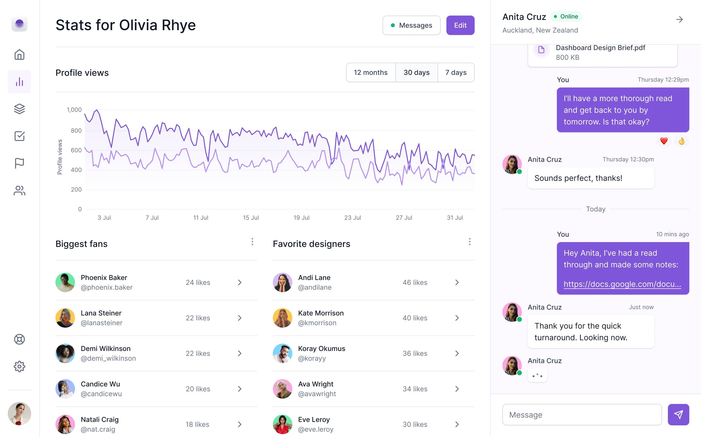
StartWise is a website that helps users create a valuable business from start to finish with an online course, live coaching, and connections to a network of investors and advisors.
Timeline
Role
Feb 2023 - Apr 2023
Product Designer
Entrepreneurs are guided step-by-step with bite-sized content and a synced to do list. Interactive assessments and exercises are automatically exported to editable files.
Weekly live coaching and connections to advisors helps users stay on track and gain industry and skill-specific knowledge.
I created the entire website from the ground up. I started with research, positioned the product in the marketplace, designed the website from scratch, and validated the design with users.
StartWise
Observation
Current start-up courses that don’t require an application are not comprehensive enough and not personalized around the knowledge base of the founder
I previously founded two start-ups. Through my experience and secondary research, I made the following observations:
Every founder has different gaps, yet most paid offerings are generalized.
Start-up courses are not personalized
Start-ups that get into application-only accelerators raise 171% more funding, yet only 3% of start-ups get access to application-only opportunities, showing pay-to-play options aren’t doing enough.
Pay-to-play options fall short
Most paid courses only teach a fraction of the information entrepreneurs need to know.
Offerings are not comprehensive enough


Generative Interview Insights
Entrepreneurs want a start-to-finish guide, with a personalized, comprehensive curriculum and access to live coaching and advisors
First-time entrepreneurs are lost
First-time entrepreneurs are almost always severely lost when trying to navigate through the early stages of entrepreneurship.
Entrepreneurs want a start-to-finish guide
Books and courses are sometimes used, but early stage entrepreneurs want someone who can hold their hand through the entire process.
Flexible and personalized content is preferred
Personalization, being comprehensive but enabling easy access to the main points, and being guided but flexible are keys to a successful product.
Live coaching and advisors are critical
Live coaching helps founders understand whether they are going through the course steps correctly, provides objective advice, and encourages accountability. Advisors help founders with critical industry knowledge and teach them skills they lack.
“I feel like I’m swinging from vine to vine in the jungle, with no idea where I’m going and just barely holding on.”
“When I first started out in entrepreneurship, I skipped a lot of steps that would have been helpful to go through. I wish I had someone to walk me through the process.”
“There is not one company that says, I’ll hold your hand throughout the whole process, where I get access to content but also talk to real humans.”
I conducted generative interviews with seven entrepreneurs, 4 who were early stage and 3 who had sold a company, with the following insights:
User Personas
Targeting the “Motivated Beginner” persona based on their willingness to learn and their entrepreneurial experience
Single Vet Preferencer
Values continuity of care
Motivated Beginner
Eager to learn, experience ranges from a first-time entrepreneur to medium experience.
How They Guided Design:
I focused most on this segment. They influenced the step-by-step, guided aspect of the program, including the self-assessments, synced to-do-list and weekly coaching.
Target Persona
Overconfident Beginner
Low willingness to learn, experience ranges from first-timer to medium experience.
Serial Entrepreneur
Medium willingness to learn, has founded at least one successful start-up.
How They Guided Design:
Serial entrepreneurs still have plenty to learn, but likely value industry connections more. They influenced the design of the “advisors and investors” aspect of the product.
Competitive Analysis
Uncovering strengths and weaknesses of prominent start-up accelerators, online learning platforms, and guided software
Strengths: Exercises in toolkit can be exported as PDF, content is robust, and there is access to advisors and live coaching
Weaknesses: To get in you need to be accepted, and exporting content to pdf results in users being unable to edit
Strengths: Contains guided assessments that inform key decisions, and each piece of information is provided in a digestible step
Weaknesses: The amount of information shown for deductions and credits is overwhelming

Strengths: Easy to pick up where you left off, content personalized based on objectives, and easy to skip to relevant content
Weaknesses: Next button on course page is hard to find, and language and branding feels like school


How Might We
“How might we combine live coaching, self-paced content, and targeted connections to create a guided experience for early stage entrepreneurs?”
Single Vet Preferencer
Values continuity of care
Content is broken into digestible steps that start from idea stage and end with funding. A personalization quiz allows founders to build a customized curriculum, since each founder will have a different knowledge base.
Guided, personalized content that helps from start-to-finish
Founders can get almost everything done without leaving the course! Interactive exercises are automatically exported into Google Doc files. A to do list is synced with the course and also includes offline tasks.
Interactive assessments and exercises sync with files and to do’s
StartWise is one of the only pay-to-play options that offers an advisor matching program and live coaching.
Live coaching and advisors to stay on track and fill skill gaps
Landing Page
Home
Start-Up Course
Live Coaching
Advisors
Synced To Do List
Synced Files
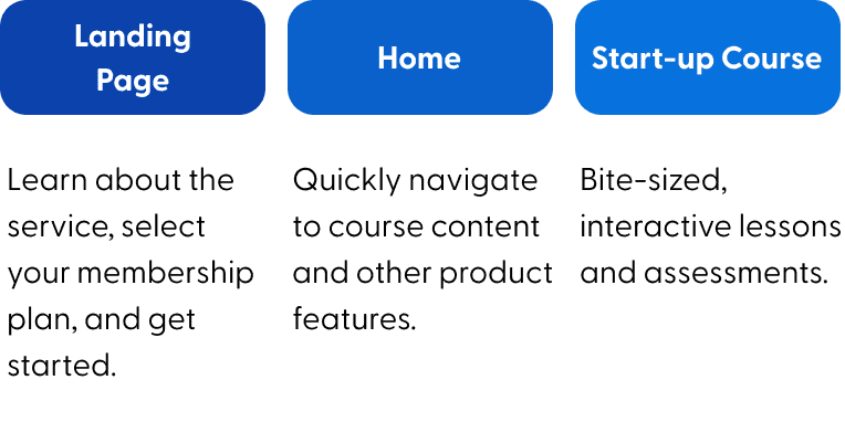
Learn about the service, select your membership plan, and get started.
Quickly navigate to course content and other product features.
Bite-sized, interactive lessons and assessments.
Weekly coaching from dedicated start-up advisors.
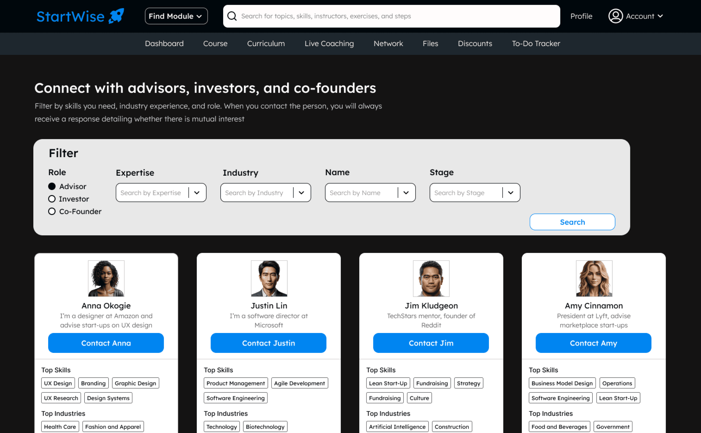
Filter for advisors and investors that fit the skills and industry experience that you need.
Each course module has its own set of tasks. It syncs with the course but also includes offline to do’s.
When founders complete exercises in the course they are auto-exported into editable Google Doc files.
High Level App Overview

Identifying features, content types, and integrations through creating a user flow

Zoomed In User Flow for Online Course
Zoomed In User Flow for To Do List, Coaching, and Advisors

User Flow
Identified three types of content - lessons, exercises, and assessments

Realized some tasks need to be completed offline

Identified need for a quiz to personalize experience

Realized to do list and course should be synced, should be able to get to course from to do list

Realized advisors and coaches need booking functionality

Final Designs
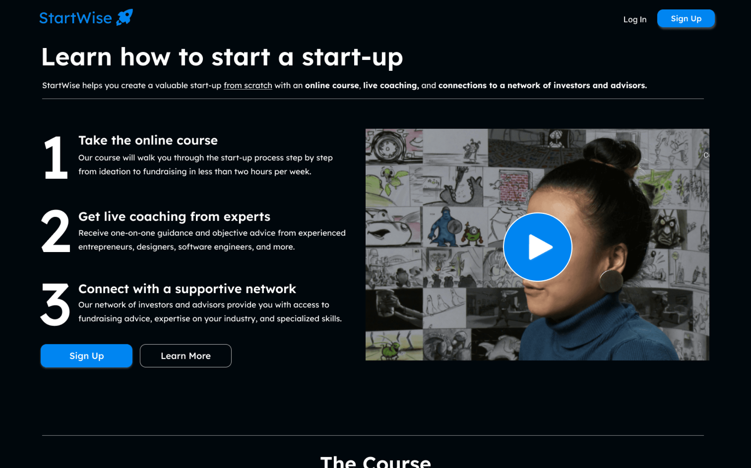
Landing page clearly shows value proposition
This is a novel and complex product, so the top frame clearly communicates the product benefits. The large numbers make it easy to follow and provide structure.
The rest of the page shows, rather than tells, the product benefits through imagery.
Home page makes it easy to get to the content you want
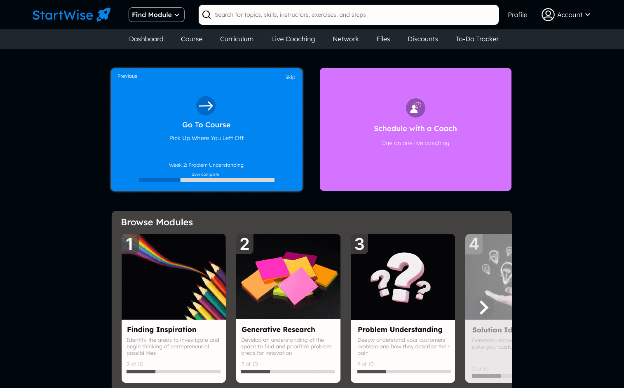
The course and coaching are featured prominently since they are used most often. The progress bar and title on the course card make it easy to remember where you are.

Course guides you through each step without leaving the product
Exercises are designed to feel like you are working in a notebook, to spark creativity.
From user testing, I added “Time to Complete” above the exercises, as well as a transcript for the videos.
The course features text inputs that automatically sync with Google Doc files, turning your work into investor-ready documents.
To do list and files sync seamlessly with the course
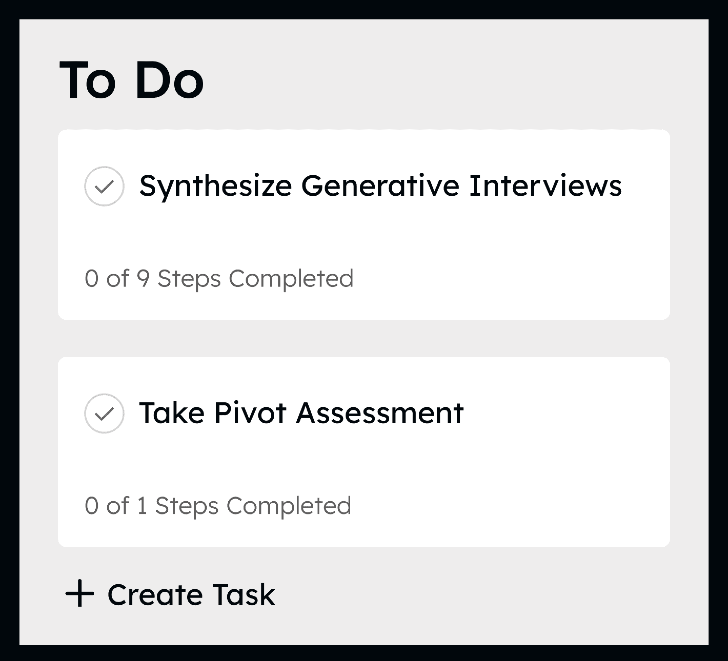
The to do list complements the course by providing tasks to execute both in the app and offline. Steps are automatically checked off as you complete the course.
The Files page automatically updates based on the exercises in the course and is organized into key strategic documents.
The page is designed to be very clear about “To Do”, “In-Progress”, and “Completed” to give you satisfaction and a feeling of control, and a modal for each individual task provides a description and smaller steps.
Making it easy to find advisors and coaches that fit your start-up
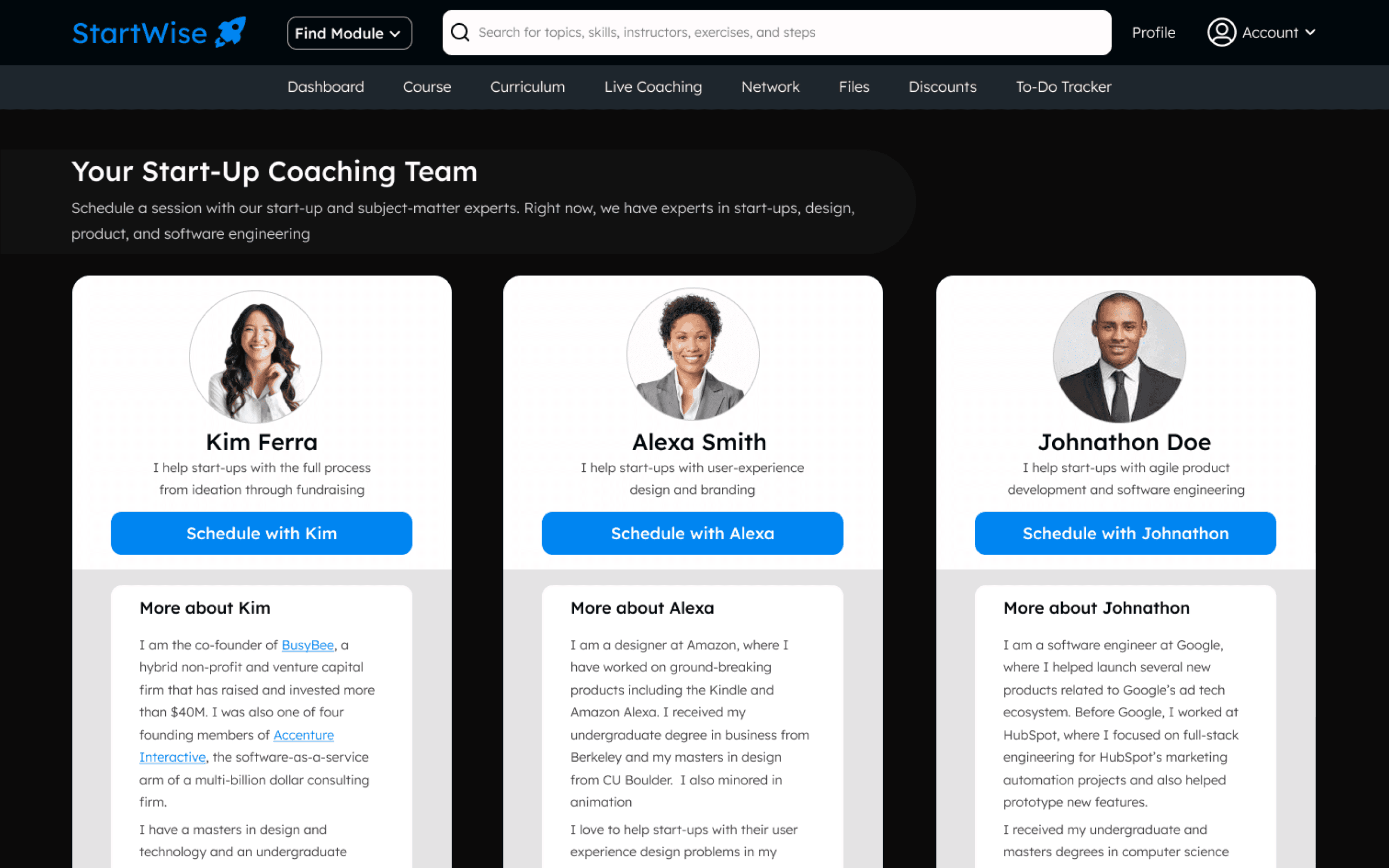
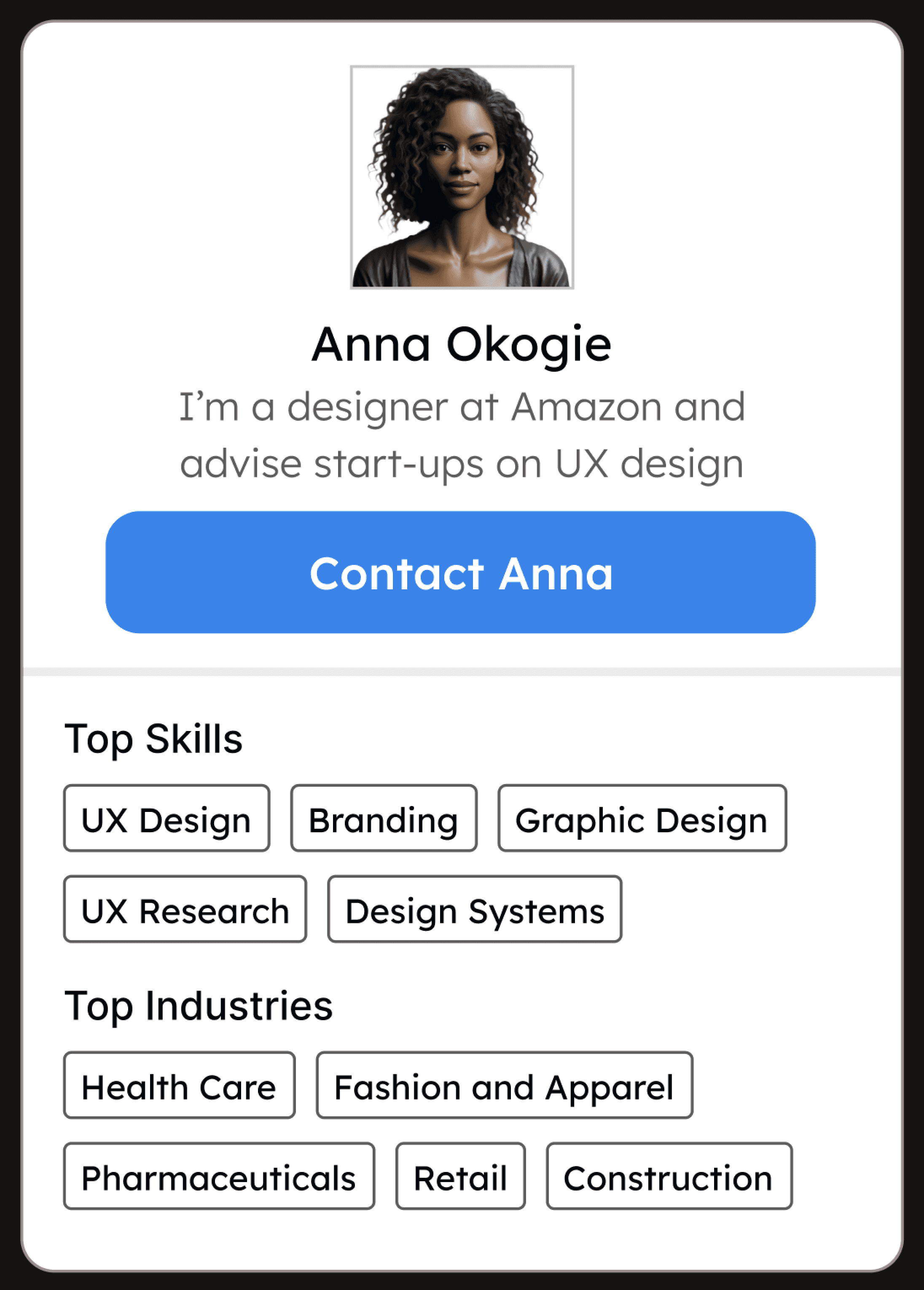
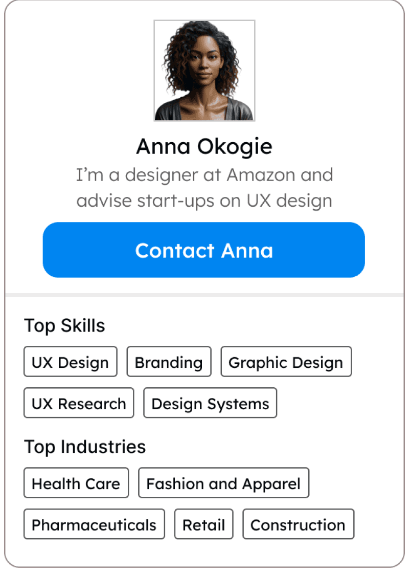
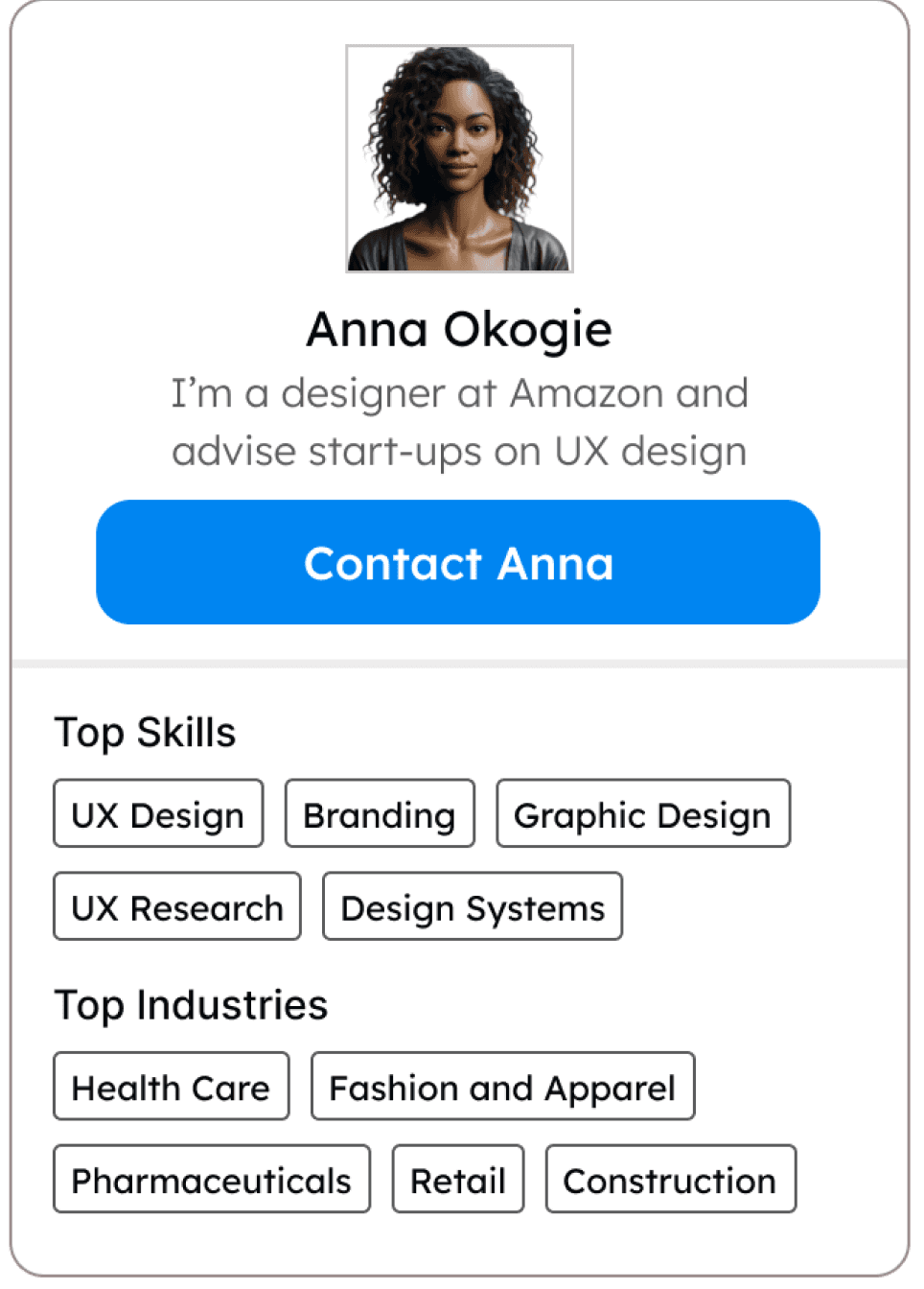
The Advisors and Investors page features robust filtering by industry, experience, and role. Advisor cards are easy to scan for skills and experience, with a prominent scheduling button.
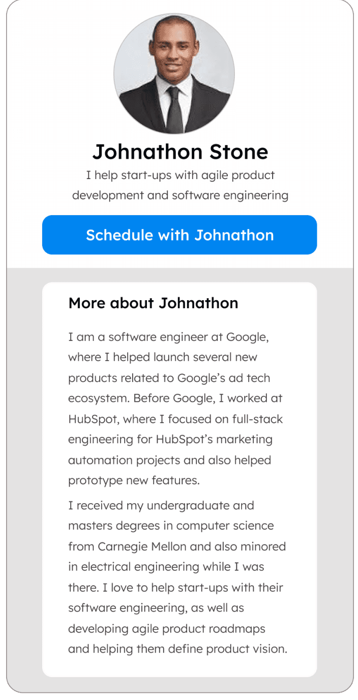
The Coaching page provides more detailed information for those that founders will work with on a more frequent basis.
User Testing
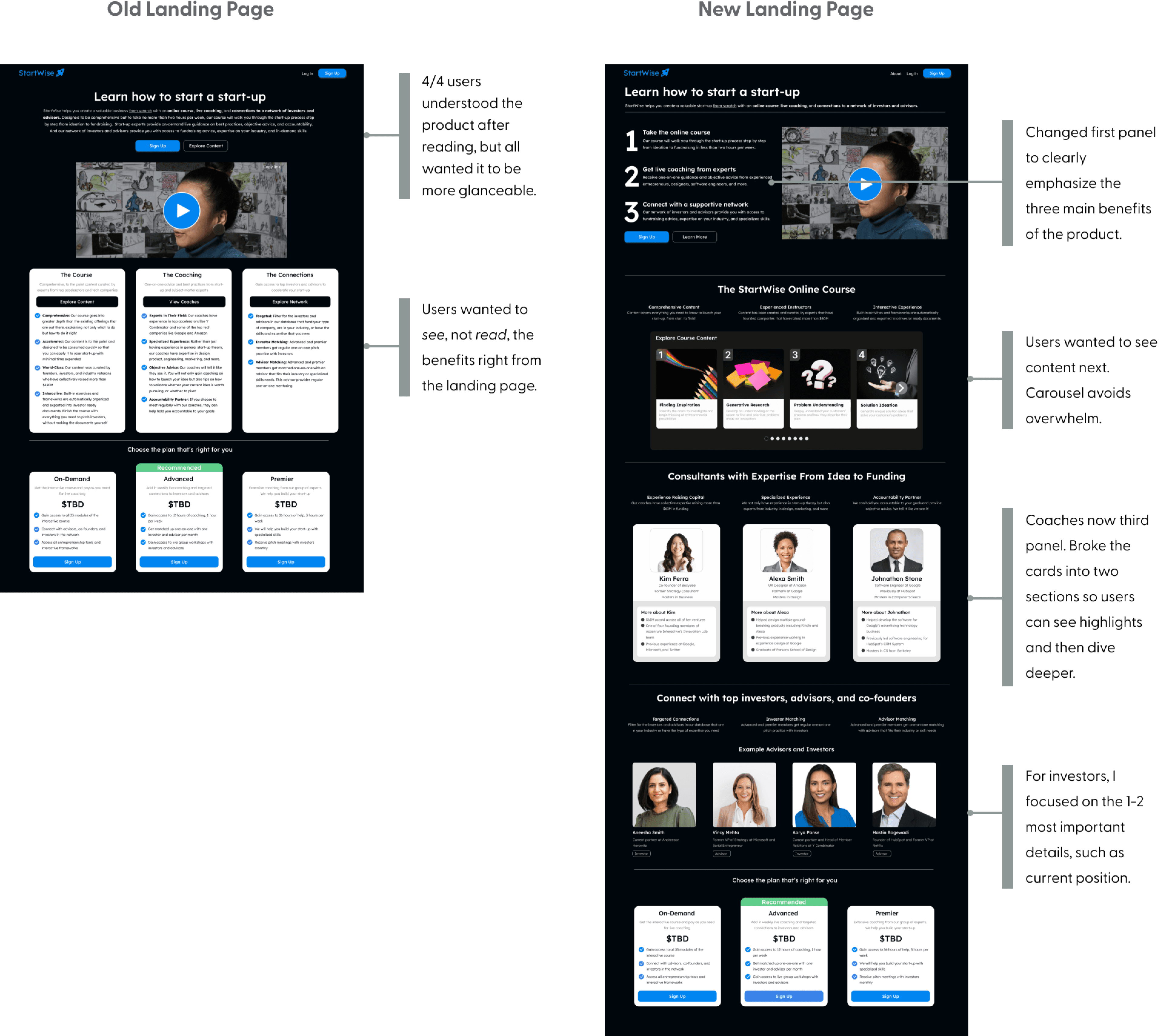
Changing the landing page after user testing to make content more digestible and to showcase the benefits with imagery
I conducted user testing with four start-up founders. Task completion was high, but testing led me to make changes to final designs. The largest changes were to the landing page.

Next Steps
If I had more time, I would build out more of the “personalization” quiz, as well as more of the interactive assesments.
Reflection
Create more opportunities for gamification in the website
Focus on building out the golden path first
I could have made the “golden path” more robust, by adding in interactive assessments and the personalization quiz upfront in my limited time rather than less important features like the Files page.
Although I included a certificate, it might make sense to have badges for each module and a leaderboard to add an element of gamification to the product.


StartWise is a website that helps users create a valuable business from start to finish with an online course, live coaching, and connections to a network of investors and advisors.
Timeline
Role
Feb 2023 - Apr 2023
Product Designer
Entrepreneurs are guided step-by-step with bite-sized content and a synced to do list. Interactive assessments and exercises are automatically exported to editable files.
Weekly live coaching and connections to advisors helps users stay on track and gain industry and skill-specific knowledge.
I created the entire website from the ground up. I started with research, positioned the product in the marketplace, designed the website from scratch, and validated the design with users.
StartWise
Generative Interview Insights
Entrepreneurs want a start-to-finish guide, with a personalized, comprehensive curriculum and access to live coaching and advisors
First-time entrepreneurs are lost
First-time entrepreneurs are almost always severely lost when trying to navigate through the early stages of entrepreneurship.
Flexible and personalized content is preferred
Personalization, being comprehensive but enabling easy access to the main points, and being guided but flexible are keys to a successful product.
Live coaching and advisors are critical for founders
Live coaching helps founders understand whether they are going through the course steps correctly, provides objective advice, and encourages accountability. Advisors help founders with critical industry knowledge and teach them skills they lack.
Entrepreneurs want a start-to-finish guide
Books and courses are sometimes used, but early stage entrepreneurs want someone who can hold their hand through the entire process.
I conducted generative interviews with seven entrepreneurs, 4 who were early stage and 3 who had sold a company
Observation
Current start-up courses that don’t require an application are not comprehensive enough and not personalized around the knowledge base of the founder
I previously founded two start-ups. Through my experience and secondary research, I made the following observations:
Every founder has different gaps, yet most paid offerings are generalized.
Start-up courses are not personalized
Start-ups that get into application-only accelerators raise 171% more funding, yet only 3% of start-ups get access to these opportunities, showing pay-to-play options aren’t doing enough.
Pay-to-play options fall short


Most paid courses only teach a fraction of the information entrepreneurs need to know.
Offerings are not comprehensive enough


User Personas
Targeting the “Motivated Beginner” persona based on their willingness to learn and their entrepreneurial experience
Single Vet Preferencer
Values continuity of care
Motivated Beginner
Eager to learn, experience ranges from a first-time entrepreneur to medium experience.
How They Guided Design:
I focused most on this segment. They influenced the step-by-step, guided aspect of the program, including the self-assessments, synced to-do-list and weekly coaching.
Target Persona
Overconfident Beginner
Low willingness to learn, experience ranges from first-timer to medium experience.
Serial Entrepreneur
Medium willingness to learn, has founded at least one successful start-up.
How They Guided Design:
Serial entrepreneurs still have plenty to learn, but likely value industry connections more. They influenced the design of the “advisors and investors” aspect of the product.
Competitive Analysis
Uncovering strengths and weaknesses of prominent start-up accelerators, online learning platforms, and guided software
Strengths: Exercises in toolkit can be exported as PDF, content is robust, and there is access to advisors and live coaching
Weaknesses: To get in you need to be accepted, and exporting content to pdf results in users being unable to edit
Strengths: Contains guided assessments that inform key decisions, and each piece of information is provided in a digestible step
Weaknesses: The amount of information shown for deductions and credits is overwhelming
Strengths: Easy to pick up where you left off, content personalized based on objectives, and easy to skip to relevant content
Weaknesses: Next button on course page is hard to find, and language and branding feels like school


How Might We
“How might we combine live coaching, self-paced content, and targeted connections to create a guided experience for early stage entrepreneurs?”
Identifying features, content types, and integrations through creating a user flow
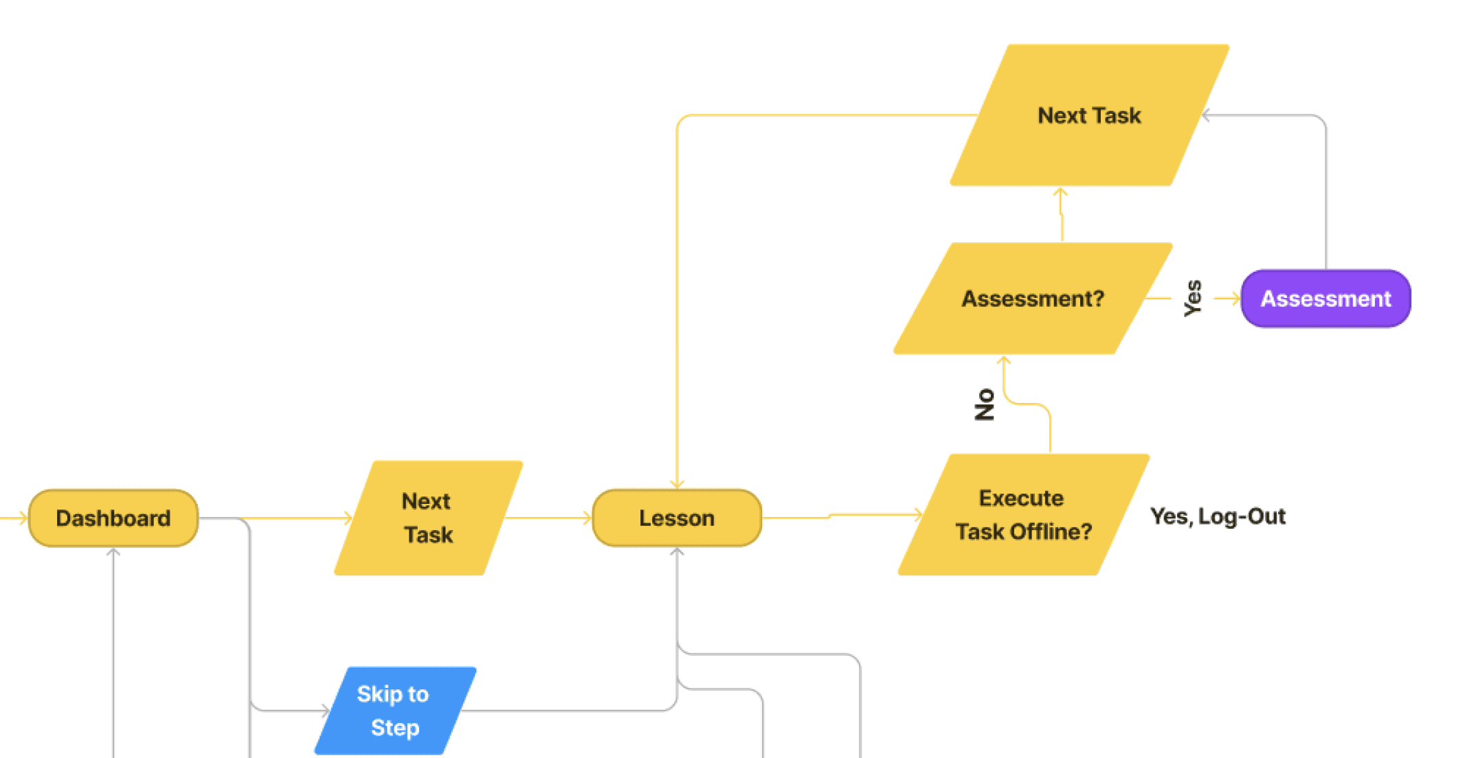

Zoomed In User Flow for Online Course
Zoomed In User Flow for To Do List, Coaching, and Advisors
User Flow
Identified three types of content - lessons, exercises, and assessments


Realized some tasks need to be completed offline


Identified need for a quiz to personalize experience


Realized to do list and course should be synced


Realized advisors and coaches need booking functionality


Final Designs
Landing page clearly shows value proposition
This is a novel and complex product, so the top frame clearly communicates the product benefits. The large numbers make it easy to follow and provide structure.
The rest of the page shows, rather than tells, the product benefits through imagery.
Home page makes it easy to get to the content you want
The course and coaching are featured prominently since they are used most often. The progress bar and title on the course card make it easy to remember where you are.


Course guides you through each step without leaving the product
Exercises are designed to feel like you are working in a notebook, to spark creativity.
From user testing, I added “Time to Complete” above the exercises, as well as a transcript for the videos.
The course features text inputs that automatically sync with Google Doc files, turning your work into investor-ready documents.
To do list and files sync seamlessly with the course
The to do list complements the course by providing tasks to execute both in the app and offline. Steps are automatically checked off as you complete the course.
The page is designed to be very clear about “To Do”, “In-Progress”, and “Completed” to give you satisfaction and a feeling of control, and a modal for each individual task provides a description and smaller steps.
The Files page automatically updates based on the exercises in the course and is organized into key strategic documents.
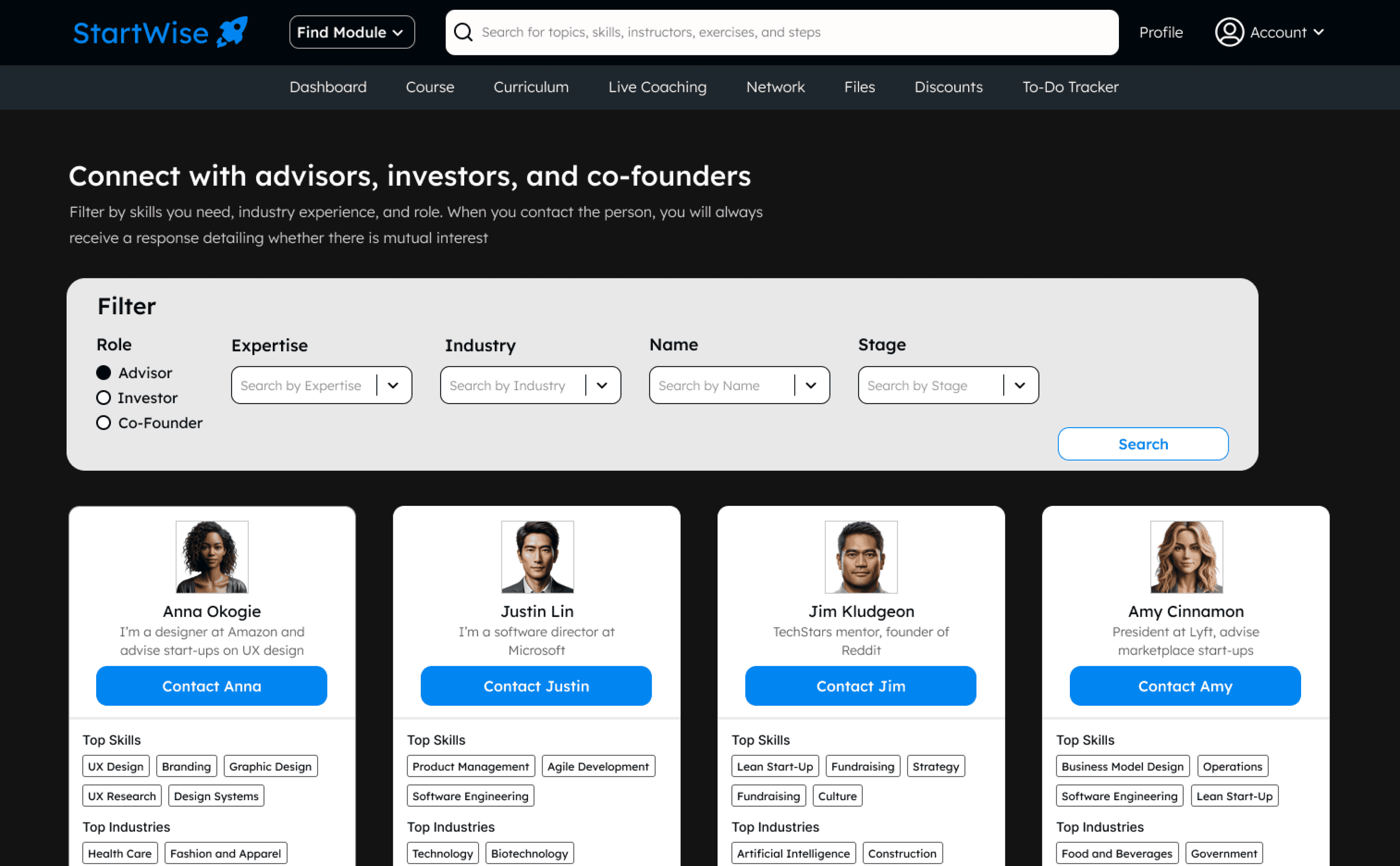



Making it easy to find advisors and coaches that fit your start-up
The Advisors and Investors page features robust filtering by industry, experience, and role. Advisor cards are easy to scan for skills and experience, with a prominent scheduling button.
The Coaching page provides more detailed information for those that founders will work with on a more frequent basis.
User Testing
Changing the landing page after user testing to make content more digestible and to showcase the benefits with imagery
I conducted user testing with four start-up founders. Task completion was high, but testing led me to make changes to final designs. The largest changes were to the landing page.

Next Steps
If I had more time, I would build out more of the “personalization” quiz, as well as more of the interactive assesments.
Reflection
Create more opportunities for gamification in the website
Focus on building out the golden path of the product first
I could have made the “golden path” more robust, by adding in interactive assessments and the personalization quiz upfront in my limited time rather than less important features like the Files page.
Although I included a certificate, it might make sense to have badges for each module and a leaderboard to add an element of gamification to the product.
Single Vet Preferencer
Values continuity of care
Landing Page
Learn about the service, select your membership plan, and get started.
Home
Quickly navigate to course content and other product features.
Start-up Course
Bite-sized, interactive lessons and assessments.
Live Coaching
Weekly coaching from dedicated start-up advisors.
Advisors
Filter for advisors and investors that fit the skills and industry experience that you need.
Synced To Do List
When founders complete exercises in the course they are exported into editable Google Doc files.
Synced Files
Each course module has its own set of tasks. It syncs with the course but also includes offline to do’s.
High Level App Overview
Content is broken into digestible steps that start from idea stage and end with funding. A personalization quiz allows founders to build a customized curriculum, since each founder will have a different knowledge base.
Guided, personalized content that helps from start-to-finish


Founders can get almost everything done without leaving the course! Interactive exercises are automatically exported into Google Doc files. A to do list is synced with the course and also includes offline tasks.
Interactive assessments and exercises sync with files and to do’s


StartWise is one of the only pay-to-play options that offers an advisor matching program and live coaching.
Live coaching and advisors to stay on track and fill skill gaps


StartWise
StartWise is a website that helps users create a valuable business from start to finish with an online course, live coaching, and connections to a network of investors and advisors.
Entrepreneurs are guided step-by-step with bite-sized content and a synced to do list. Interactive assessments and exercises are automatically exported to editable files.
Weekly live coaching and connections to advisors helps users stay on track and gain industry and skill-specific knowledge.
I created the entire website from the ground up. I started with research, positioned the product in the marketplace, designed the website from scratch, and validated the design with users.
Role
Product Designer
Timeline
Feb 2023 - Apr 2023
Generative Interview Insights
Entrepreneurs want a start-to-finish guide, with a personalized, comprehensive curriculum and access to live coaching and advisors
I conducted generative interviews with seven entrepreneurs, 4 who were early stage and 3 who had sold a company, with the following insights:
First-time entrepreneurs are lost
First-time entrepreneurs are almost always severely lost when trying to navigate through the early stages of entrepreneurship.
Entrepreneurs want a start-to-finish guide
Books and courses are sometimes used, but early stage entrepreneurs want someone who can hold their hand through the entire process.
Flexible and personalized content is preferred
Personalization, being comprehensive but enabling easy access to the main points, and being guided but flexible are keys to a successful product.
Live coaching and advisors are critical
Live coaching helps founders understand whether they are going through the course steps correctly, provides objective advice, and encourages accountability. Advisors help founders with critical industry knowledge and teach them skills they lack.
Observation
Current start-up courses that don't require an application are not comprehensive enough and not personalized around the knowledge base of the founder
I previously founded two start-ups. Through my experience and secondary research, I made the following observations:
Start-up courses are not personalized
Every founder has different gaps, yet most paid offerings are generalized.

Pay-to-play options fall short
Start-ups that get into application-only accelerators raise 171% more funding, yet only 3% of start-ups get access to these opportunities, showing pay-to-play options aren’t doing enough.

Offerings are not comprehensive enough
Most paid courses only teach a fraction of the information entrepreneurs need to know.
Motivated Beginner
Eager to learn, experience ranges from a first-time entrepreneur to medium experience.
How They Guided Design:
I focused most on this segment. They influenced the step-by-step, guided aspect of the program, including the self-assessments, synced to-do-list and weekly coaching.
Target Persona
User Personas
Targeting the "Motivated Beginner" persona based on their willingness to learn and their entrepreneurial experience
Overconfident Beginner
Low willingness to learn, experience ranges from first-timer to medium experience.
Serial Entrepreneur
Medium willingness to learn, has founded at least one successful start-up.
How They Guided Design:
Serial entrepreneurs still have plenty to learn, but likely value industry connections more. They influenced the design of the “advisors and investors” aspect of the product.
Competitive Analysis
Uncovering strengths and weaknesses of prominent start-up accelerators, learning platforms, and guided software
Coursera
Strengths: Easy to pick up where you left off, content personalized based on objectives, and easy to skip to relevant content
Weaknesses: Next button on course page is hard to find, and language and branding feels like school
TechStars
Strengths: Exercises in toolkit can be exported as PDF, content is robust, and there is access to advisors and live coaching
Weaknesses: To get in you need to be accepted, and exporting content to pdf results in users being unable to edit
TurboTax
Strengths: Contains guided assessments that inform key decisions, and each piece of information is provided in a digestible step
Weaknesses: The amount of information shown for deductions and credits is overwhelming
How Might We’s
"How might we combine live coaching, self-paced content, and targeted connections to create a guided experience for early stage entrepreneurs?"
High Level App Overview




Guided, personalized content that helps from start-to-finish
Content is broken into digestible steps that start from idea stage and end with funding. A personalization quiz allows founders to build a customized curriculum, since each founder will have a different knowledge base.

Interactive exercises and assessments sync with files and to do's
Founders can get almost everything done without leaving the course! Interactive exercises are automatically exported into Google Doc files. A to do list is synced with the course and also includes offline tasks.
Live coaching and advisors to stay on track and fill skill gaps
StartWise is one of the only pay-to-play options that offers an advisor matching program and live coaching.

User Flow
Identifying features, content types, and integrations through creating a user flow
User Flow for online course

Identified three types of content - lessons, exercises, and assessments

Realized some tasks need to be completed offline
User Flow for To Do List, Coaching, and Advisors

Identified need for a quiz to personalize experience

Realized to do list and course should be synced

Realized advisors and coaches need booking functionality


Final Designs


Landing page clearly shows value proposition
This is a novel and complex product, so the top frame clearly communicates the product benefits. The large numbers make it easy to follow and provide structure.
The rest of the page shows, rather than tells, the product benefits through imagery.
Home page makes it easy to get to the content you want
The course and coaching are featured prominently since they are used most often. The progress bar and title on the course card make it easy to remember where you are.
Course guides you through each step without leaving the product
The course features text inputs that automatically sync with Google Doc files, turning yourwork into investor-ready documents.
Exercises are designed to feel like you are working in a notebook, to spark creativity.
From user testing, I added “Time to Complete” above the exercises, as well as a transcript for the videos.


To do list and files sync seamlessly with the course
The to do list complements the course by providing tasks to execute both in the app and offline. Steps are automatically checked off as you complete the course.
The page is designed to be very clear about “To Do”, “In-Progress”, and “Completed” to give you satisfaction and a feeling of control, and a modal for each individual task provides a description and smaller steps.
The Files page automatically updates based on the exercises in the course and is organized into key strategic documents.
Making it easy to find advisors and coaches that fit your start-up
The Advisors and Investors page features robust filtering by industry, experience, and role. Advisor cards are easy to scan for skills and experience, with a prominent scheduling button.
The Coaching page provides more detailed information for those that founders will work with on a more frequent basis.


User Testing
Changing the landing page after user testing to make content more digestible and to showcase the benefits with imagery
I conducted user testing with four start-up founders. Task completion was high, but testing led me to make changes to final designs. The largest changes were to the landing page.


Next Steps
If I had more time, I would build out more of the "personalization" quiz, as well as more of the interactive assessments.
Reflection
Create more opportunities for gamification in the website
Although I included a certificate, it might make sense to have badges for each module and a leaderboard to add an element of gamification to the product.
Focus on building out the golden path first
I could have made the “golden path” more robust, by adding in interactive assessments and the personalization quiz upfront in my limited time rather than less important features like the Files page.
