




Timeline
Oct 2023 - Dec 2023
Role
Product Designer
Mosaic
Mosaic is a design-journaling, visual inspiration, and brainstorming app that fits seamlessly into a designer’s workflow, increasing design efficiency and effectiveness, all at their fingertips.
Designers can quickly document their design decisions and learnings, automatically create a draft portfolio case study using generative AI, find visual inspiration from top companies, and brainstorm on design concepts to improve their designs.
I designed the entire app from the ground up. I conducted user research, strategically positioned the product in the market, created high-fidelity prototypes, and validated the prototypes with users.

Observation
No journaling tools for UX designers
My professor recommended I keep a design journal to document and reflect on my design decisions and learnings. When I began journaling, I grew frustrated that there were no journaling tools made for UX designers. I also reflected on my design process, and realized I was dissatisfied with the experience of finding inspiration and brainstorming on mobile.
Generative Interview Insights
Creating a journaling habit is difficult due to lack of support for designers. Also, visual inspiration and brainstorming could be better integrated into workflows
I interviewed six UX designers, three students and three in industry, with the following insights:
6 out of 6 believe design journaling is valuable, but creating a habit is difficult because current solutions lack UX flows, and 3 out of 6 cited the barrier of duplicating effort when transferring to their portfolio.
Lack of journaling support for UX designers
5 out of 6 stated transferring designs from camera roll to Figma is a pain, 6 out of 6 want to annotate strengths and weaknesses when they first see a design, and 3 out of 6 are looking for a better inspiration solution.
Redundancy in visual inspiration workflow
4 out of 6 thought brainstorming away from computer on mobile is more relaxing, but the Apple Notes app, which every interviewee used, gets disorganized for 5 out of 6.
Disorganized brainstorming on mobile
Competitive Analysis: Features
Uncovering market gaps with a competitive analysis
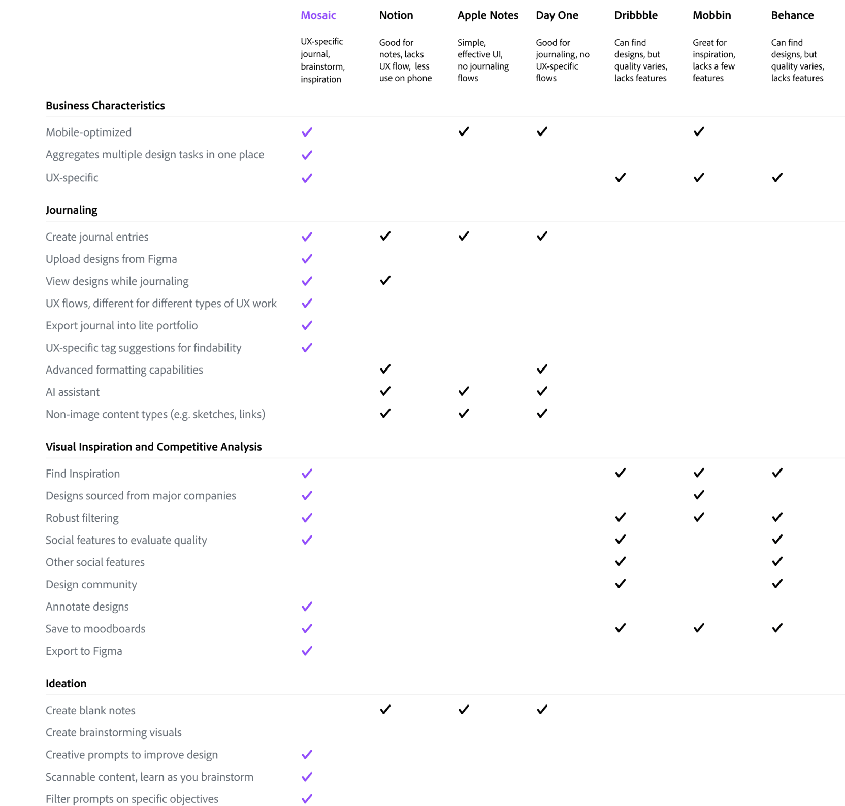
Generalist competitors don’t organize documentation in a way that makes sense for designers, don’t have the right prompts, don’t integrate with Figma, and the documentation process doesn’t group decisions or handle images well.
Existing journaling apps are generic, not built for UX designers
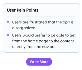
Current visual inspiration competitors don’t allow annotation of inspiration next to the visual, lack Figma integration, and don’t organize content into Figma mood boards. Also, for the journal, there is redundant effort when transferring to a portfolio.
Current competitors don’t integrate themselves into designers’ workflows
No competitor offers design journaling, brainstorming, and visual inspiration in one place. This results in multiple apps being used for related tasks.
Competitors only focus on one design aspect, resulting in siloes
How Might We’s
“How might we help designers be more efficient when design journaling, finding visual inspiration, and brainstorming, and think more deeply throughout these processes?”
How might we make design journaling faster, immediately useful, and organized in a way that saves future effort and enhances thinking?
How might we make design inspiration solutions fit seamlessly into designers’ workflows while also increasing design quality?
How might we enhance the brainstorming process to help designers find novel solutions to problems in less time?
Single Vet Preferencer
Values continuity of care
Home
Design Journal,
with Visuals
Design Journal, Text Only
AI Portfolio Creator
Find Visual Inspiration
Directed Brainstorming
Journal Timeline
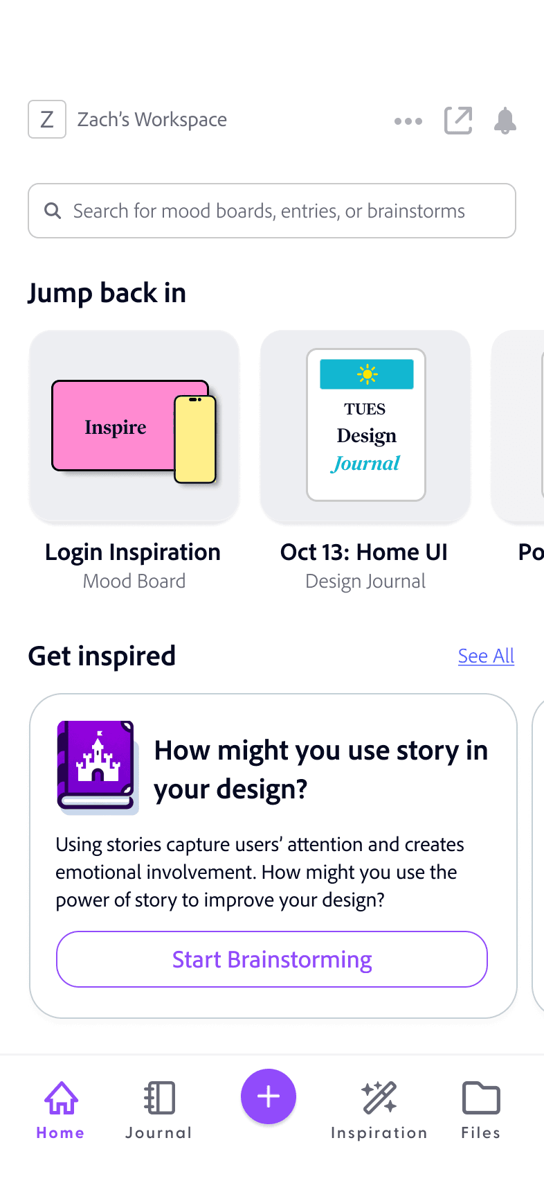
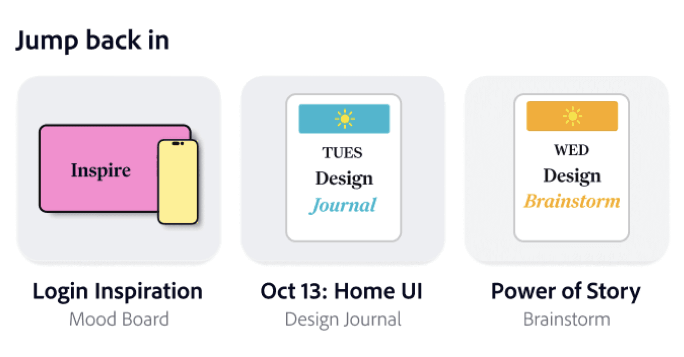
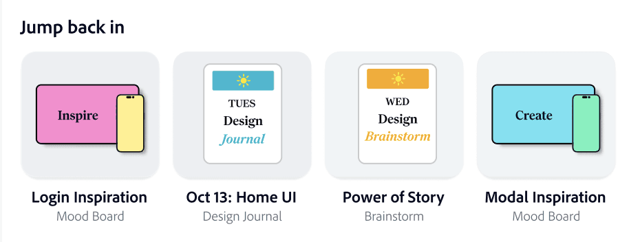
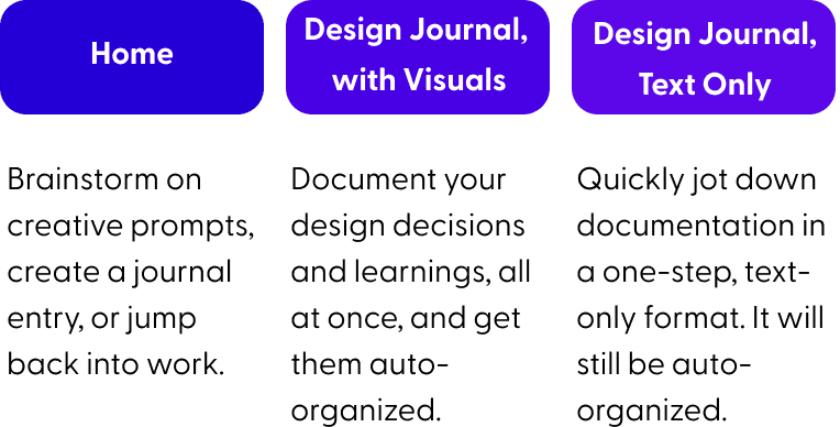
Brainstorm on creative prompts, create a journal entry, or jump back into work.
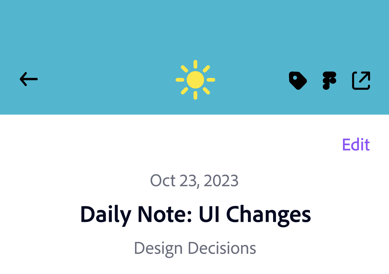
Document your design decisions and learnings, all at once, and get them auto-organized.
Quickly jot down documentation in a one-step, text-only format. It will still be auto-organized.
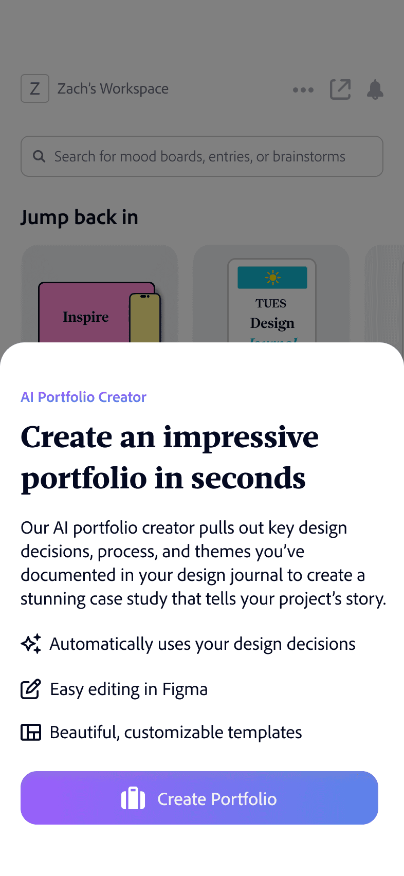
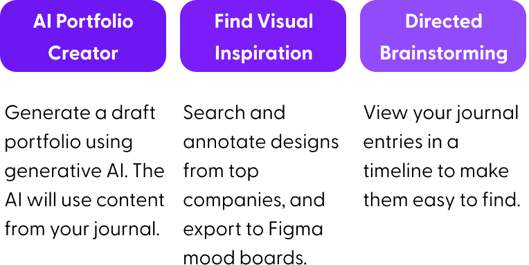
Generate a draft portfolio using generative AI. The AI will use content from your journal.
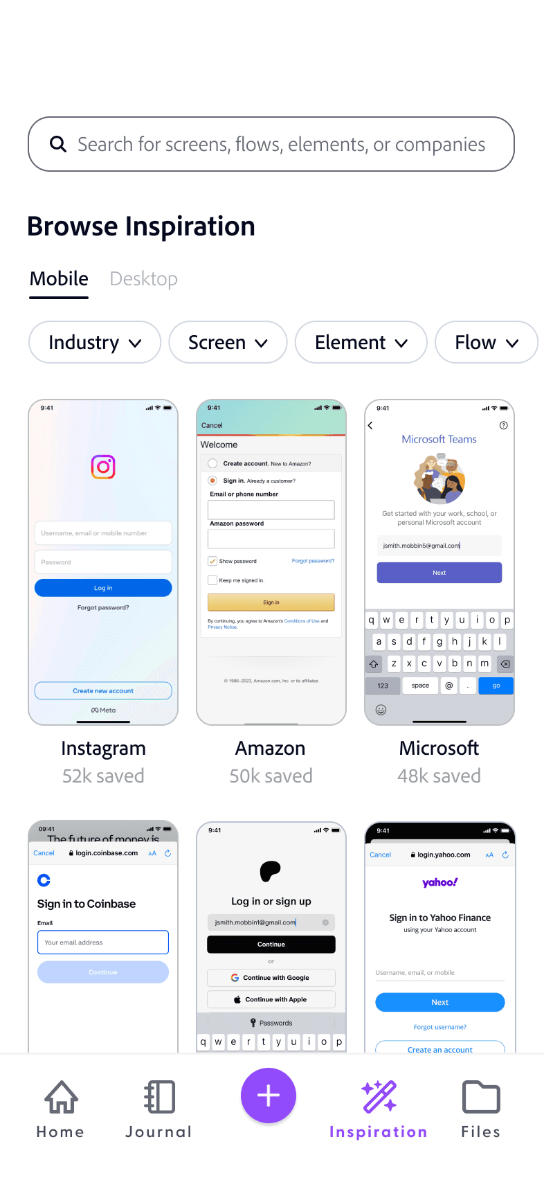
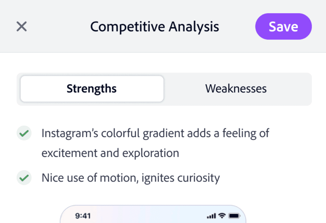
Search and annotate designs from top companies, and export to Figma mood boards.
Swipe through a digital card deck of design-specific prompts to spark ideas.
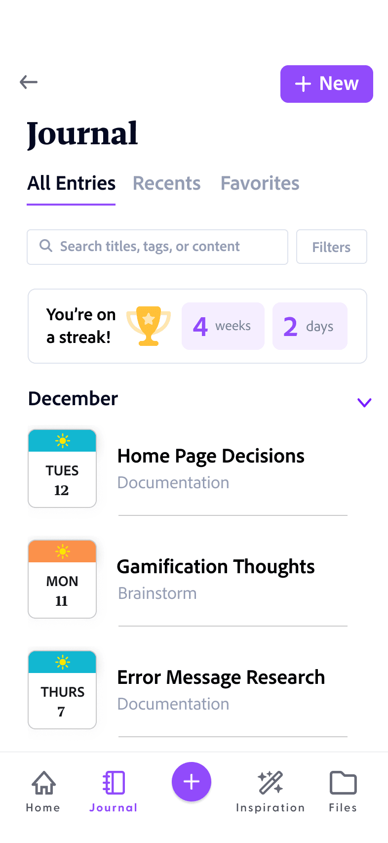
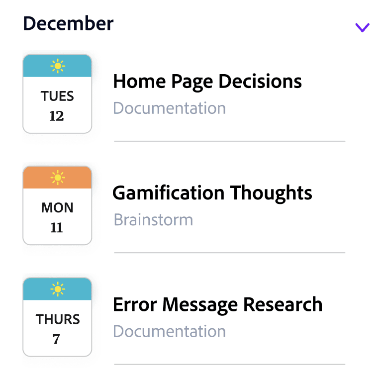
View your journal entries in a timeline to make them easy to find.
Unlike generalist competitors, every feature of the journal is made for designers. The journal layout, Figma integration, and auto-organization speed up design documentation and encourage deeper thinking.
Journaling features tailored to UX Designers
Mosaic integrates seamlessly into designers’ workflows. Designers can write strengths and weaknesses beside visual inspiration and export into Figma mood boards. The AI portfolio tool eliminates redundant work by helping create a case study.
Better integration into designers’ workflows
Mosaic is the only app that offers design journaling, brainstorming, and visual inspiration in one place. These tasks are complementary and all often completed on mobile.
Aggregating unique set of design tasks
High Level App Overview
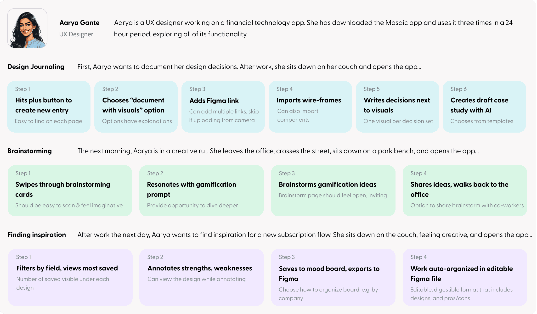
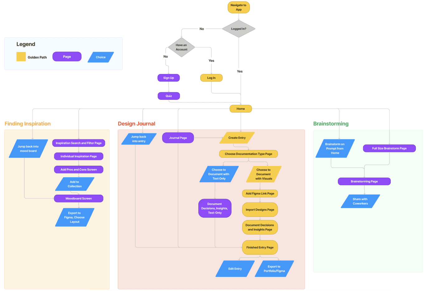
Identifying the steps needed in each use case through a user flow, and then creating three scenarios to identify priorities for each step and big-picture interaction principles
User Flow and Product Scenarios
Interaction Design Priorities
Scenarios
Throughout app, position visuals besides writing for easy reference

Wherever possible, automate, shorten, or eliminate steps
Auto-organize documentation by grouping visuals and design decisions together. If there is no visual, group under themes


Encourage user to consistently document by using gamification

Steps Identified through User Flow
Design Journal: “Add Figma link” page, “Journal timeline” page, “Jump back into entry” on home page

Visual inspiration: “Add to collection” page, “Jump back into mood board” on home page, “Export to Figma” modal


Final Designs
Design journal
Efficient documentation for two distinct use cases
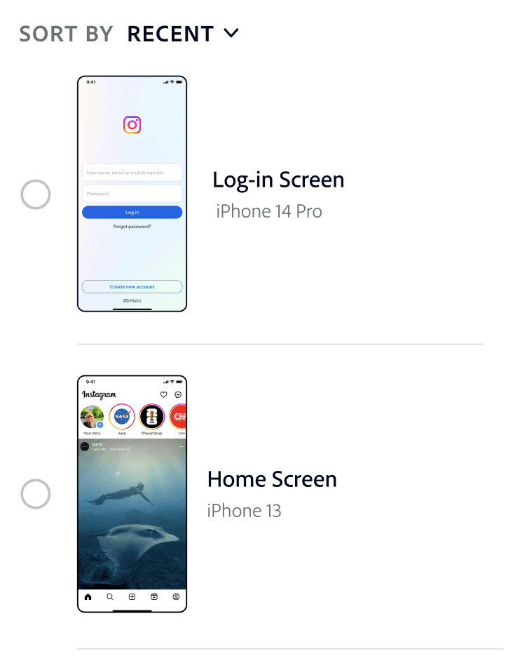
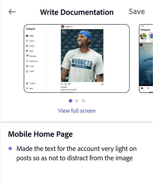
The use cases vary based on your time. You can quickly jot down notes in one step or upload all visuals at once and document your decisions below each.
Auto-organizing insights into glanceable drop-downs
Journal is auto-organized so it’s easy to find and skim entries when you want to reflect or add to your portfolio.
The design journal is designed to speed up documentation and encourage thoughtful reflection.
Improving reflection by placing decisions next to designs
Unlike current journaling tools, decisions directly below each design reduces forgetfulness and encourages deep thinking.
Engaging users with gamification in journal
To encourage users to consistently journal, the app tracks your weekly and daily streaks
Removing friction by shortening and automating journal steps
Documentation is done all at once, eliminating steps
Portfolio generator auto-generates a portfolio based on your journal
Multiple Figma screens can be uploaded together to save time
Text-only documentation is extremely simple, only one step

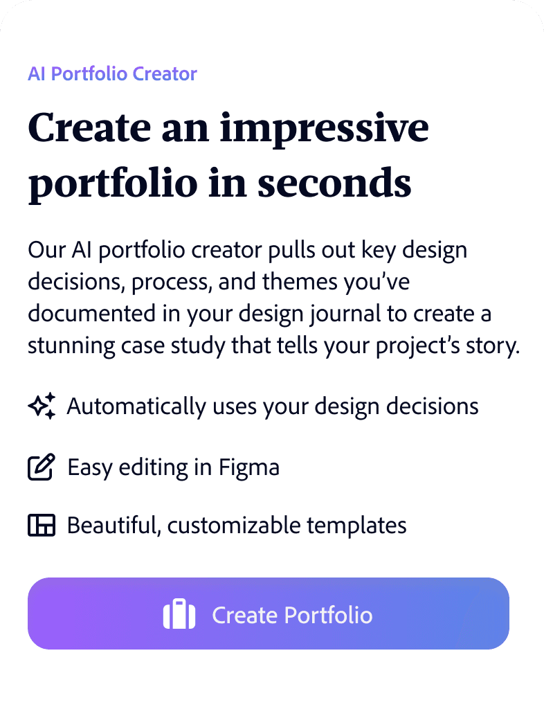


Generative AI portfolio creator synthesizes your design journal & creates a draft portfolio
Instead of manually transferring to a portfolio, an AI portfolio creator uses the design journal content to synthesize a draft case study. This feature uses similar technology to the AI presentation creator in Microsoft’s CoPilot.

Directed Brainstorming
Filter by goals or categories for specific problems
Prompts right on home page encourage engagement
Imagery and shape that spurs the imagination
There is an unobtrusive filter in the top right that can help you focus your brainstorming session.
In addition to the full screen view, you get immediate value out of prompts whenever you log into the app. New prompts will be displayed each time the app is opened to keep them fresh.
Illustrations create an imaginative feel, and the experience is designed to feel like a deck of cards. Physical card decks are a popular commercial format for brainstorming, such as IDEO’s “Method Cards”.
Swipe through brainstorming prompts designed to spark creativity and improve your designs.
Visual Inspiration
Fits seamlessly into workflow
Filters & social validation ensure relevant, quality designs
No more dragging images from your camera roll into Figma and forgetting what you liked about them! You can annotate strengths and weaknesses right from the app and then continue working on it in Figma.
There are significant filtering capabilities that go beyond Dribbble or Behance and you can view the designs’ popularity with users. Both help ensure that the right designs are selected for inspiration.
Find inspiration for a project, annotate strengths and weaknesses, and export as an auto-organized mood board in Figma.

User Testing
Adding a bulk documentation use case based on user testing
Old Journal
Original format good for short journal entries but users couldn’t upload multiple designs at once
All users liked the original layout for quick documentation. However, 3 out of 4 wanted to upload all their visuals in one step, especially if journaling weekly, bi-weekly, or monthly.
New journal allows users to upload visuals in one step and document decisions all at once
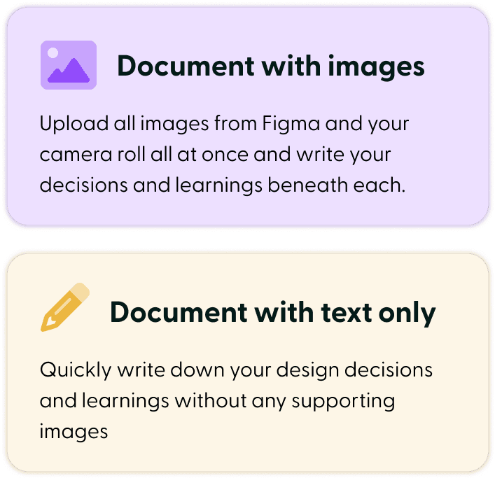
The new layout starts with the choice of either uploading all your visuals at once from Figma or camera roll and writing decisions for each in a carousel, or using a quick, text-only option that skips the need to import. The layout also accommodates all screen sizes.
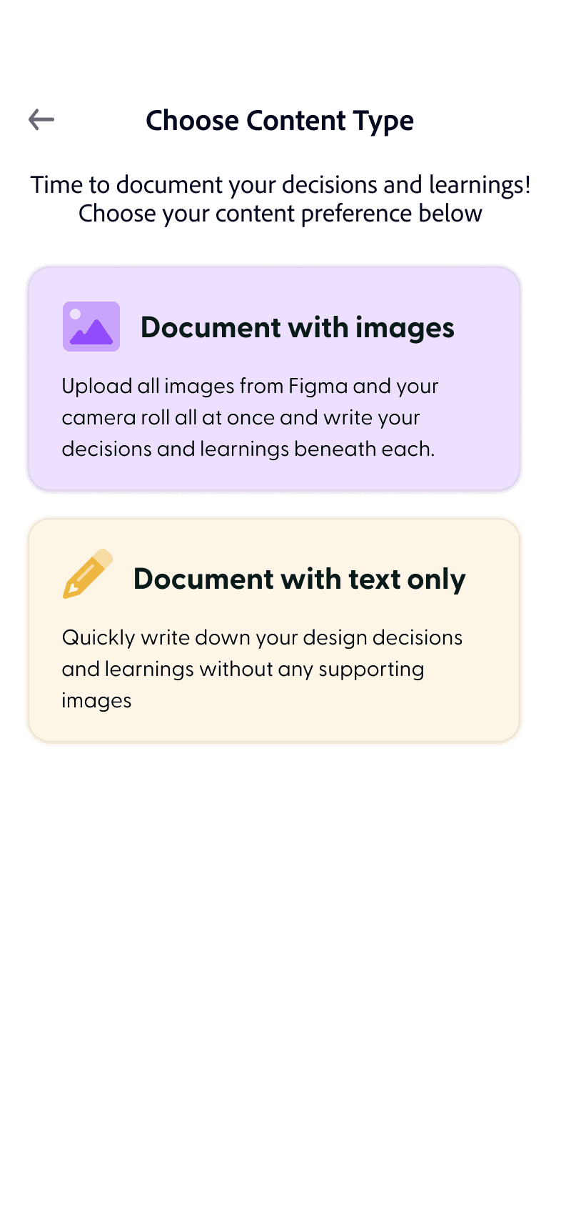
Step 1
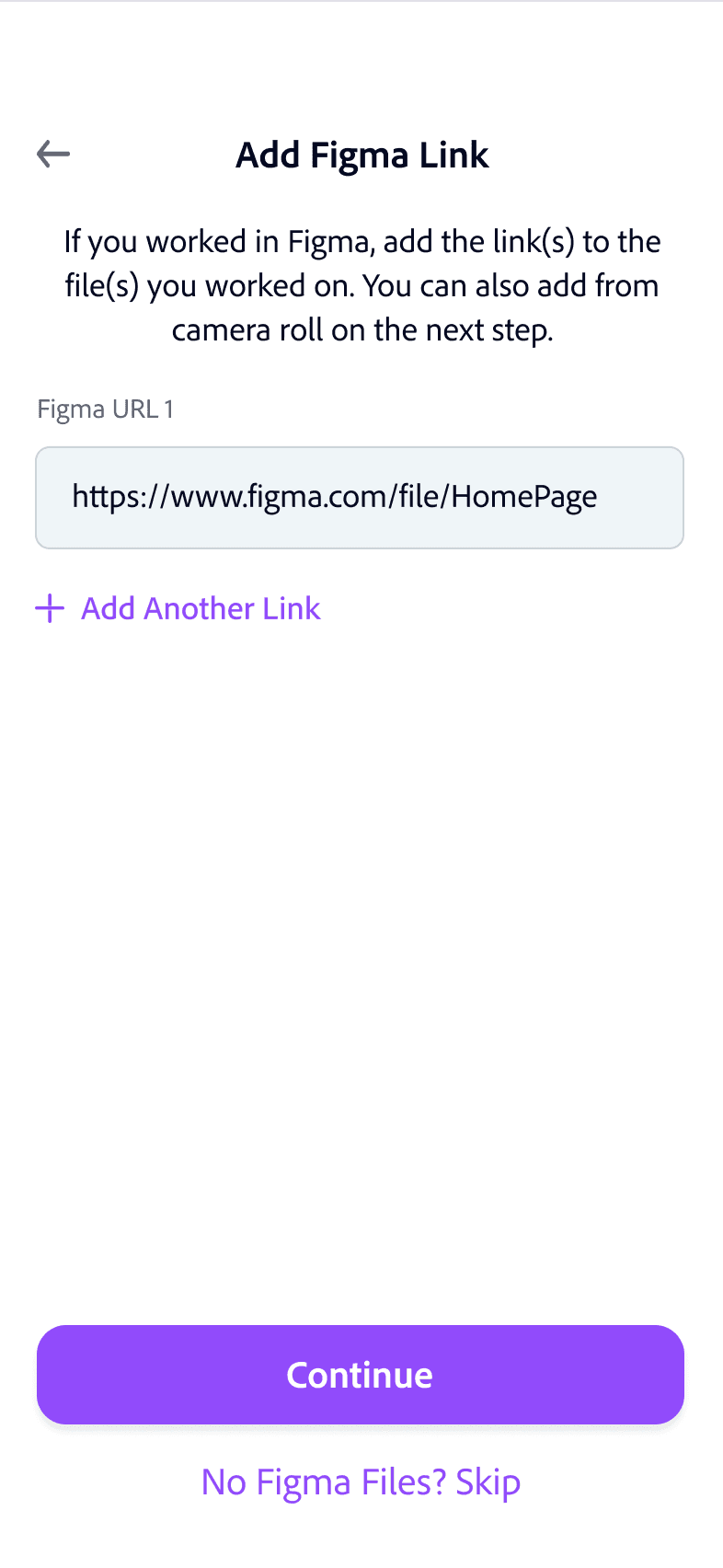
Step 2
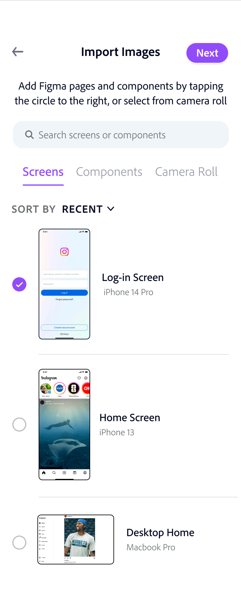
Step 3
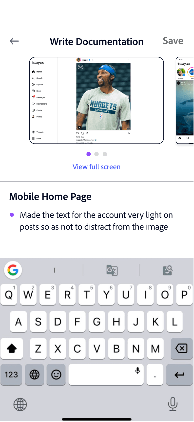
Step 4
New Journal Bulk Documentation Use Case
I conducted user testing with four designers. Task completion was high, but I made changes to most screens, with the journal being most impacted.
Creating an aesthetic that inspires creativity
Primary
Background
“Mafra” for serif
Aa Bb Cc Dd Ee Ff Gg Hh Ii Jj Kk
“Clean” for sans serif
Aa Bb Cc Dd Ee Ff Gg Hh Ii Jj Kk
Secondary
Neutrals
Header 1 - (Mafra 30)
Header 2 - (Clean 24)
Header 3 - (Clean 21)
Body - (Clean 18)
Description - (Clean 15)





Colorful palette made for designers
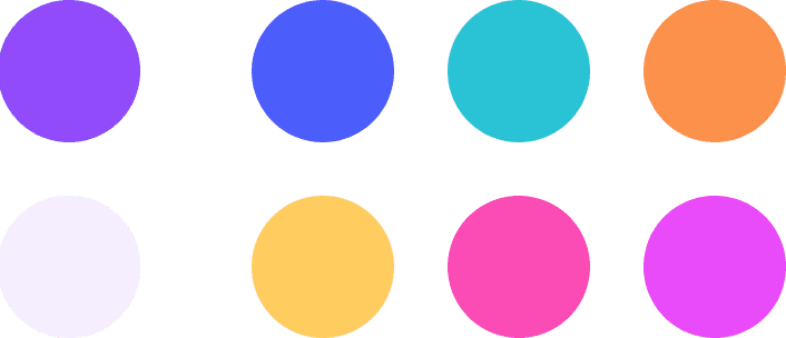
I used a bright, colorful palette since the app is for designers. Purple was selected as base color because of its association with creativity.
Typography that feels creative but professional
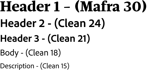
Serif font “Mafra” features asymmetrical serifs that add flair but still feels credible. “Clean” for sans serif feels creative yet professional.
Imagery that inspires and accentuates meaning
I created visuals with inspiring language and bright colors to distinguish content types. For prompts, I made semi-realistic colored outline icons that feel imaginative. I also used iconography and color to accentuate the purpose of the journal and AI portfolio creator.
User Testing
Adding a bulk documentation use case based on user testing
Old Journal
Original format good for short journal entries but users couldn’t upload multiple designs at once
All users liked the original layout for quick documentation. However, 3 out of 4 wanted to upload all their visuals in one step, especially if journaling weekly, bi-weekly, or monthly.
New journal allows users to upload visuals in one step and document decisions all at once
The new layout starts with the choice of either uploading all your visuals at once from Figma or camera roll and writing decisions for each in a carousel, or using a quick, text-only option that skips the need to import. The layout also accommodates all screen sizes.

Step 1

Step 2

Step 3

Step 4
New Journal Bulk Documentation Use Case
I conducted user testing with four designers. Task completion was high, but I made changes to most screens, with the journal being most impacted.
Next Steps
If I had more time, I would build out more of the “AI portfolio” and “export to Figma” functionality and conduct another round of user testing.
What I Learned
When there are many potential features, maintain focus on the core differentiators
I do best when I consistently design journal, as it helps clarify my thinking
I learned that the more consistently I wrote down my thinking, the easier it was to spot logical gaps and generate thoughtful new ideas. I’ll take these learnings and apply them to my career!
At the start, I planned on having note-taking functionality since interviewees expressed interest. However, I realized this would be too many features, and blank notes aren’t a differentiator.


Timeline
Oct 2023 - Dec 2023
Role
Product Designer
Mosaic
Mosaic is a design-journaling, visual inspiration, and brainstorming app that fits seamlessly into a designer’s workflow, increasing design efficiency and effectiveness, all at their fingertips.
Designers can quickly document their design decisions and learnings, automatically create a draft portfolio case study using generative AI, find visual inspiration from top companies, and brainstorm on design concepts to improve their designs.
I designed the entire app from the ground up. I conducted user research, strategically positioned the product in the market, created high-fidelity prototypes, and validated the prototypes with users.

Observation
No journaling tools for UX designers
My professor recommended I keep a design journal to document and reflect on my design decisions and learnings. When I began journaling, I grew frustrated that there were no journaling tools made for UX designers. I also reflected on my design process, and realized I was dissatisfied with the experience of finding inspiration and brainstorming on mobile.
Generative Interview Insights
Creating a journaling habit is difficult due to lack of support for designers. Also, visual inspiration and brainstorming could be better integrated into workflows
I interviewed six UX designers, three students and three in industry, with the following insights:
6 out of 6 believe design journaling is valuable, but creating a habit is difficult because current solutions lack UX flows, and 3 out of 6 cited the barrier of duplicating effort when transferring to their portfolio.
Lack of journaling support for UX designers
5 out of 6 stated transferring designs from camera roll to Figma is a pain, 6 out of 6 want to annotate strengths and weaknesses when they first see a design, and 3 out of 6 are looking for a better inspiration solution.
Redundancy in visual inspiration workflow
4 out of 6 thought brainstorming away from computer on mobile is more relaxing, but the Apple Notes app, which every interviewee used, gets disorganized for 5 out of 6.
Disorganized brainstorming on mobile
Competitive Analysis: Features
Uncovering market gaps with a competitive analysis
Generalist competitors don’t organize documentation in a way that makes sense for designers, don’t have the right prompts, don’t integrate with Figma, and the documentation process doesn’t group decisions or handle images well.
Existing journaling apps are generic, not built for UX designers
Current visual inspiration competitors don’t allow annotation of inspiration next to the visual, lack Figma integration, and don’t organize content into Figma mood boards. Also, for the journal, there is redundant effort when transferring to a portfolio.
Current competitors don’t integrate themselves into designers’ workflows
No competitor offers design journaling, brainstorming, and visual inspiration in one place. This results in multiple apps being used for related tasks.
Competitors only focus on one design aspect, resulting in siloes


How Might We’s
“How might we help designers be more efficient when design journaling, finding visual inspiration, and brainstorming, and think more deeply throughout these processes?”
How might we make design journaling faster, immediately useful, and organized in a way that saves future effort and enhances thinking?
How might we enhance the brainstorming process to help designers find novel solutions to problems in less time?
How might we make design inspiration solutions fit seamlessly into designers’ workflows while also increasing design quality?
Single Vet Preferencer
Values continuity of care
Unlike generalist competitors, every feature of the journal is made for designers. The journal layout, Figma integration, and auto-organization speed up design documentation and encourage deeper thinking.
Journaling features tailored to UX Designers
Mosaic integrates seamlessly into designers’ workflows. Designers can write strengths and weaknesses besides visual inspiration and export into Figma mood boards. The AI portfolio tool eliminates redundant work by helping create a case study.
Better integration into designers’ workflows
Mosaic is the only app that offers design journaling, brainstorming, and visual inspiration in one place. These tasks are complementary and all often completed on mobile.
Aggregating unique set of design tasks


Home
Brainstorm on creative prompts, create a journal entry, or jump back into work.
Design Journal,
with Visuals
Document your design decisions and learnings, all at once, and get them auto-organized.
Design Journal, Text Only
Quickly jot down documentation in a one-step, text-only format. It will still be auto-organized.
AI Portfolio Creator
Generate a draft portfolio using generative AI. The AI will use content from your journal.
Find Visual Inspiration
Search and annotate designs from top companies, and export to Figma mood boards.
Directed Brainstorming
Swipe through a digital card deck of design-specific prompts to spark ideas.
Journal Timeline
View your journal entries in a timeline to make them easy to find.
High Level App Overview


Identifying the steps needed in each use case through a user flow, and then creating three scenarios to identify priorities for each step and big-picture interaction principles
User Flow and Product Scenarios
Interaction Design Priorities
Scenarios
Throughout app, position visuals besides writing for easy reference


Auto-organize documentation by grouping visuals and design decisions together. If there is no visual, group under themes


Wherever possible, automate, shorten, or eliminate steps


Encourage user to consistently document by using gamification



Steps Identified through User Flow
Design Journal: “Add Figma link” page, “Journal timeline” page, “Jump back into entry” on home page


Visual inspiration: “Add to collection” page, “Jump back into moodboard” on home page, “Export to Figma” modal


Final Designs
Design journal
Efficient documentation for two distinct use cases
The use cases vary based on your time. You can quickly jot down notes in one step or upload all visuals at once and document your decisions below each.
Auto-organizing insights into glanceable drop-downs
Journal is auto-organized so it’s easy to find and skim entries when you want to reflect or add to your portfolio.
The design journal is designed to speed up documentation and encourage thoughtful reflection.
Improving reflection by placing decisions next to designs
Unlike current journaling tools, decisions directly below each design reduces forgetfulness and encourages deep thinking.


Engaging users with gamification in journal
To encourage users to consistently journal, the app tracks your weekly and daily streaks
Removing friction by shortening and automating journal steps
Documentation is done all at once, eliminating steps
Portfolio generator auto-generates a case study based on your journal
Multiple Figma screens can be uploaded together to save time
Text-only documentation is extremely simple, only one step


Generative AI portfolio creator synthesizes your design journal & creates a draft portfolio
Instead of manually transferring to a portfolio, an AI portfolio creator uses the design journal content to synthesize a draft case study. This feature uses similar technology to the AI presentation creator in Microsoft’s CoPilot.


Directed Brainstorming
Filter by categories for specific problems
Prompts on home page encourage engagement
Imagery and shape that spurs the imagination
There is an unobtrusive filter in the top right that can help you focus your brainstorming session.
In addition to the full screen view, you get immediate value out of prompts whenever you log into the app. New prompts will be displayed each time the app is opened to keep them fresh.
Illustrations create an imaginative feel, and the experience is designed to feel like a deck of cards. Physical card decks are a popular commercial format for brainstorming, such as IDEO’s “Method Cards”.
Swipe through brainstorming prompts designed to spark creativity and improve your designs.
Visual Inspiration
Fits seamlessly into workflow
Filters & social validation ensure relevant, quality designs
No more dragging images from your camera roll into Figma and forgetting what you liked about them! You can annotate strengths and weaknesses right from the app and then continue working on it in Figma.
There are significant filtering capabilities that go beyond Dribbble or Behance and you can view the designs’ popularity with users. Both help ensure that the right designs are selected for inspiration.
Find inspiration for a project, annotate strengths and weaknesses, and export as an auto-organized mood board in Figma.


Creating an aesthetic that inspires creativity
Primary
Background
“Mafra” for serif
Aa Bb Cc Dd Ee Ff Gg Hh Ii Jj Kk
“Clean” for sans serif
Aa Bb Cc Dd Ee Ff Gg Hh Ii Jj Kk
Secondary
Neutrals
Header 1 - (Mafra 30)
Header 2 - (Clean 24)
Header 3 - (Clean 21)
Body - (Clean 18)
Description - (Clean 15)


Colorful palette made for designers
I used a bright, colorful palette since the app is for designers. Purple was selected as base color because of its association with creativity.
Typography that feels creative but professional
Serif font “Mafra” features asymmetrical serifs that add flair but still feels credible. “Clean” for sans serif feels creative yet professional.
Imagery that inspires and accentuates meaning
I created visuals with inspiring language and bright colors to distinguish content. For prompts, I made semi-realistic colored outline icons that feel imaginative. I also used iconography and color to accentuate the purpose of the journal and AI portfolio creator.
User Testing
Adding a bulk documentation use case based on user testing
Old Journal
Original format good for short journal entries but users couldn’t upload multiple designs at once
All users liked the original layout for quick documentation. However, 3 out of 4 wanted to upload all their visuals in one step, especially if journaling weekly, bi-weekly, or monthly.
New journal allows users to upload visuals in one step and document decisions all at once
The new layout starts with the choice of either uploading all your visuals at once from Figma or camera roll and writing decisions for each in a carousel, or using a quick, text-only option that skips the need to import. The layout also accommodates all screen sizes.


Step 1


Step 2


Step 3


New Journal Bulk Documentation Use Case
Step 4
I conducted user testing with four designers. Task completion was high, but I made changes to most screens, with the journal being most impacted.
Next Steps
If I had more time, I would build out more of the “AI portfolio” and “export to Figma” functionality and conduct another round of user testing.
What I Learned
When there are many potential features, maintain focus on the core differentiators
I do best when I consistently design journal, as it helps clarify my thinking
I learned that the more consistently I wrote down my thinking, the easier it was to spot logical gaps and generate thoughtful new ideas. I’ll take these learnings and apply them to my career!
At the start, I planned on having note-taking functionality since interviewees expressed interest. However, I realized this would be too many features, and blank notes aren’t a differentiator.
Mosaic
Mosaic is a design-journaling, visual inspiration, and brainstorming app that fits seamlessly into a designer’s workflow, increasing design efficiency and effectiveness, all at their fingertips.
Designers can quickly document their design decisions and learnings, automatically create a draft portfolio case study using generative AI, find visual inspiration from top companies, and brainstorm on design concepts to improve their designs.
I designed the entire app from the ground up. I conducted user research, strategically positioned the product in the market, created high-fidelity prototypes, and validated the prototypes with users.
Role
Product Designer
Timeline
Oct 2023 - Dec 2023
Observation
No journaling tools for UX designers
My professor recommended I keep a design journal to document and reflect on my design decisions and learnings. When I began journaling, I grew frustrated that there were no journaling tools made for UX designers. I also reflected on my design process, and realized I was dissatisfied with the experience of finding inspiration and brainstorming on mobile.


Generative Interview Insights
Creating a journaling habit is difficult due to lack of support for designers. Also, visual inspiration and brainstorming could be better integrated into workflows
Lack of journaling support for UX designers
6 out of 6 believe design journaling is valuable, but creating a habit is difficult because current solutions lack UX flows, and 3 out of 6 cited the barrier of duplicating effort when transferring to their portfolio.
Redundancy in visual inspiration workflow
5 out of 6 stated transferring designs from camera roll to Figma is a pain, 6 out of 6 want to annotate strengths and weaknesses when they first see a design, and 3 out of 6 are looking for a better inspiration solution.
Disorganized brainstorming on mobile
4 out of 6 thought brainstorming away from computer on mobile is more relaxing, but the Apple Notes app, which every interviewee used, gets disorganized for 5 out of 6.
Competitive Analysis: Features
Uncovering market gaps with a competitive analysis
Existing journaling apps are generic, not built for UX designers
Generalist competitors don’t organize documentation in a way that makes sense for designers, don’t have the right prompts, don’t integrate with Figma, and the documentation process doesn’t group decisions or handle images well.
Current competitors don’t integrate themselves into designers’ workflows
Current visual inspiration competitors don’t allow annotation of inspiration next to the visual, lack Figma integration, and don’t organize content into Figma mood boards. Also, for the journal, there is redundant effort when transferring to a portfolio.
Competitors only focus on one design aspect, resulting in siloes
No competitor offers design journaling, brainstorming, and visual inspiration in one place. This results in multiple apps being used for related tasks.
How Might We’s
“How might we help designers be more efficient when design journaling, finding visual inspiration, and brainstorming, and think more deeply throughout these processes?”
How might we make design journaling faster, immediately useful, and organized in a way that saves future effort and enhances thinking?
How might we make design inspiration solutions fit seamlessly into designers’ workflows while also increasing design quality?
How might we enhance the brainstorming process to help designers find novel solutions to problems in less time?


High Level App Overview





Journaling features tailored to UX Designers
Unlike generalist competitors, every feature of the journal is made for designers. The journal layout, Figma integration, and auto-organization speed up design documentation and encourage deeper thinking.


Better integration into designers’ workflows
Mosaic integrates seamlessly into designers’ workflows. Designers can write strengths and weaknesses beside visual inspiration and export into Figma mood boards. The AI portfolio tool eliminates redundant work by helping create a case study.
Aggregating unique set of design tasks
Mosaic is the only app that offers design journaling, brainstorming, and visual inspiration in one place. These tasks are complementary and all often completed on mobile.
Product Scenarios and User Flow
Identifying the steps needed in each use case through a user flow, and then creating three scenarios to identify priorities for each step and big picture interaction principles
Steps Identified Through User Flow


Design Journal: “Add Figma link” page, “Journal timeline” page, “Jump back into entry” on home page


Visual Inspiration: “Add to collection” page, “Jump back into moodboard” on home page, “Export to Figma” modal


Scenarios


Aarya Gante
UX Designer
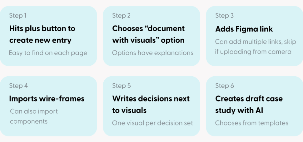
Aarya is a UX designer working on a financial technology app. She has downloaded the Mosaic app and uses it three times in a 24-hour period, exploring all of its functionality.
Scenario 1: Design Journaling
First, Aarya wants to document her design decisions. After work, she sits down on her couch and opens the app...
Scenario 2: Brainstorming
The next morning, Aarya is in a creative rut. She leaves the office, sits down on a park bench, and opens the app...
Scenario 3: Finding Inspiration
After work, she wants to find inspiration for a feature. She sits on the couch, feeling creative, and opens Mosaic...
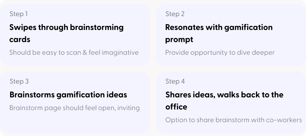


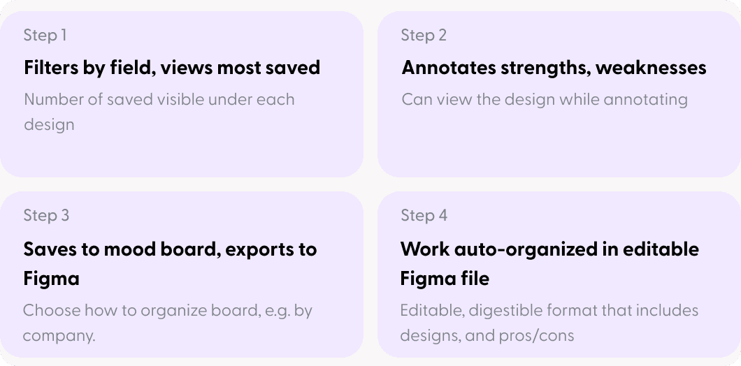

Interaction Design Priorities


Throughout app, position visuals besides writing for easy reference


Auto-organize documentation by grouping visuals and design decisions together. If there is no visual, group under themes


Wherever possible, automate, shorten, or eliminate steps


Encourage user to consistently document by using gamification
Final Designs
Design journal
The design journal is designed to speed up documentation and encourage thoughtful reflection.
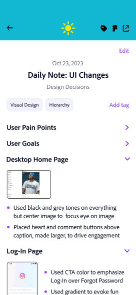
Efficient documentation for two distinct use cases
The use cases vary based on your time. You can quickly jot down notes in one step or upload all visuals at once and document their decisions below each.
Improving reflection by placing decisions next to designs
Unlike current journaling tools, decisions directly below each design reduces forgetfulness and encourages deep thinking.
Auto-organizing insights into glanceable drop-downs
Journal is auto-organized so it’s easy to find and skim entries when you want to reflect or add to your portfolio.


Engaging users with gamification in journal
To encourage users to consistently journal, the app tracks your weekly and daily streaks


Removing friction by shortening and automating journal steps
Portfolio generator auto-generates a case study based on your journal
Multiple Figma screens can be uploaded together to save time
Text-only documentation is extremely simple, only one step
Documentation is done all at once, eliminating steps


Generative AI portfolio creator synthesizes your design journal & creates a draft portfolio
Instead of manually transferring to a portfolio, an AI portfolio creator uses the design journal content to synthesize a draft case study. This feature uses similar technology to the AI presentation creator in Microsoft’s CoPilot.


Directed Brainstorming
Swipe through brainstorming prompts designed to spark creativity and improve your designs.
Imagery and shape that spurs the imagination
Illustrations create an imaginative feel, and the experience is designed to feel like a deck of cards. Physical card decks are a popular commercial format for brainstorming, such as IDEO’s “Method Cards”.
Prompts on home page encourage engagement
In addition to the full screen view, you get immediate value out of prompts whenever you log into the app. New prompts will be displayed each time the app is opened to keep them fresh.
Filter by categories for specific problems
There is an unobtrusive filter in the top right that can help you focus your brainstorming session.



Visual Inspiration
Find inspiration for a project, annotate strengths and weaknesses, and export as an auto-organized mood board in Figma.
Fits seamlessly into workflow
No more dragging images from your camera roll into Figma and forgetting what you liked about them! You can annotate strengths and weaknesses right from the app and then continue working on it in Figma.
Filters & social validation ensure relevant, quality designs
There are significant filtering capabilities that go beyond Dribbble or Behance and you can view the designs’ popularity with users. Both help ensure that the right designs are selected for inspiration.


Creating an aesthetic that inspires creativity
Colorful palette made for designers
I used a bright, colorful palette since the app is for designers. Purple was selected as base color because of its association with creativity.



Typography that feels creative but professional
Serif font “Mafra” features asymmetrical serifs that add flair but still feels credible. “Clean” for sans serif feels creative yet professional.



Imagery that inspires and accentuates meaning
I created visuals with inspiring language and bright colors to distinguish content. For prompts, I made semi-realistic colored outline icons that feel imaginative. I also used iconography and color to accentuate the purpose of the journal and AI portfolio creator.


User Testing
Adding a bulk documentation use case based on user testing
I conducted user testing with four designers. Task completion was high, but I made changes to most screens, with the journal being most impacted.
Original format good for short journal entries but users couldn’t upload multiple designs at once
All users liked the original layout for quick documentation. However, 3 out of 4 wanted to upload all their visuals in one step, especially if journaling weekly, bi-weekly, or monthly.
New journal allows users to upload visuals in one step and document decisions all at once
The new layout starts with the choice of either uploading all your visuals at once from Figma or camera roll and writing decisions for each in a carousel, or using a quick, text-only option that skips the need to import. The layout also accommodates all screen sizes.
New Journal Bulk Documentation Use Case


Step 1


Step 2


Step 3


Step 4
Next Steps
If I had more time, I would build out more of the “AI portfolio” and “export to Figma” functionality and conduct another round of user testing.
What I Learned
When there are many potential features, maintain focus on the core differentiators
At the start, I planned on having note-taking functionality since interviewees expressed interest. However, I realized this would be too many features, and blank notes aren’t a differentiator.
I do best when I consistently design journal, as it helps clarify my thinking
I learned that the more consistently I wrote down my thinking, the easier it was to spot logical gaps and generate thoughtful new ideas. I’ll take these learnings and apply them to my career!
