




House of Wags provides personalized, technology-powered veterinary care at home and in-person for owners that want to level up their pet care while also offering their pets a better experience. Owners can create a custom wellness plan with guided content and care, track their pet’s health in the app, access records and care plans, and book home, video, and in-person appointments.
As the only team member and product designer, I created the entire product from the ground up, leveraging both strategic and visual UX thinking.
Timeline
Oct 2023 - Dec 2023
Role
Product Designer
House of Wags

Observation
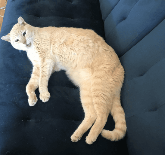
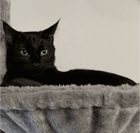
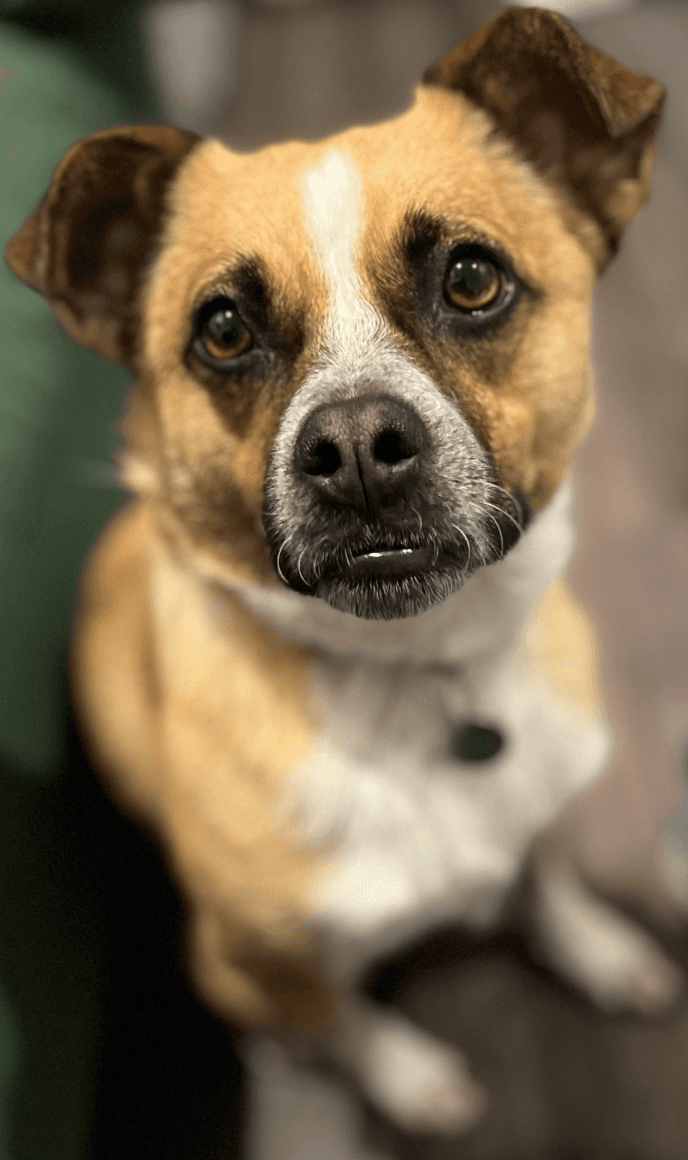
To the right are my pets, Dewey, Mozart, and Puddles. Observing them, I realized they all hate going to the vet, and taking care of them when sick is more challenging than it should be.
Generative Interview Insights
All participants reported the status quo veterinary experience is anxiety-provoking for their pet, and they all desire home vet care to reduce pet anxiety.
4 didn’t know home care exists, and 2 don’t use it because they often can’t see the same vet each time, especially with some services required in-person.
Interviewees want help taking care of sick pets and keeping their pets healthy, including tracking for new or worsening symptoms and preventive care, and digestible information on physical and emotional pet health.
1
2
3
Going to the vet is anxiety-provoking for pets, and owners want services that would make it easier for them to take care of sick pets and keep pets healthy
Home vets
In-person vets
3%
97%
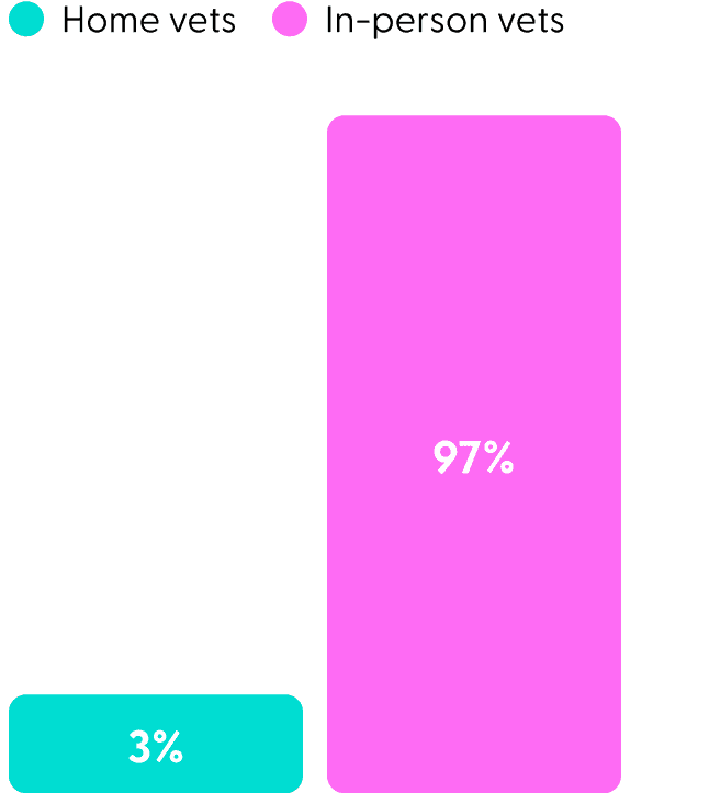
Home veterinary care only offered by 3% of vets in CO
I interviewed six adults who have pets, from a variety of income ranges, with the following insights:
Customer Personas
Discovering three distinct personas based on what they value in a vet
Single Vet Preferencer
Values continuity of care
Values forward-thinking technology and additional services
How They Guided Design:
Added additional, forward-thinking services including telehealth, personalized wellness plans, visuals for digital tracking, and health record results cards.
Extra Features Enthusiast
Values seeing the vet they know and trust every time
How They Guided Design:
Users choose their vet, every time, and this benefit is emphasized in the booking flow. Also increased vet’s connection beyond in-person interactions with digital care plan.
Single Vet Preferencer
Values convenience and enjoyability
How They Guided Design:
Linked educational resources within care plan for convenience, provided images of happy animals to increase enjoyment in booking flow, and created fun, guided tracks.
Experience Emphasizer


Competitive Analysis: Features
Uncovering market gaps with a competitive analysis
97% of vets don’t offer mobile care. The other 3% don’t usually offer in-office care and offer fewer services, so owners must use two vets if they want mobile care.
Majority of vets only offer in-office care
Most vets don’t have a mobile app, accessible health records, or telehealth, features that are now standard in human health care.
Veterinary technology is stuck in the stone ages
The small percentage of companies that do offer an app all offer a similar, and limited, set of features, leaving room for more innovation.
For those that offer an app, the features are limited


How Might We’s
“How might we improve pet health by offering tech-enabled, comprehensive care that helps pet parents be more informed and engaged in keeping their pets healthy?”
How might we implement health tracking to catch problems with pets before they get serious?
How might we apply human patient education best practices for increased understanding and adherence?
How might we use guided programs to make pet health content more digestible and rewarding?
How might we use a personalized quiz to make pet content more relevant and goal-oriented?
Single Vet Preferencer
Values continuity of care
House of Wags offers both in-person and in-home, mobile veterinary care. This allows customers to see the same vet every time, in the setting that makes sense for their pet. It also differentiates House of Wags from the majority of competitors.
Offering a broader set of veterinary services to patients
Personalized, guided programs, weight and symptom tracking, and digital care plans enable better care. This combination of features is not offered by any competitor.
Digital features unique to the industry that enable better care
Most vets don’t have a mobile app, accessible health records, or telehealth. House of Wags brings veterinary care out of the stone ages by including these features.
Bringing human health technology standards to an outdated industry
Home
Booking Appointment
Preventive Care Tracking
Digital Care Plan
Personalized,
Guided Program
Video Visit
Records
Choose a home, video, or in-person visit.
Fast, frictionless booking process that builds trust.
Track weight and symptoms with daily check-in, visualize results, and get reminders for preventive care.
Understand diagnosis, treatment, and next steps.
Create your own or choose a pre-made program with guided videos, tips, and reminders.
Conduct a remote visit straight from the app.
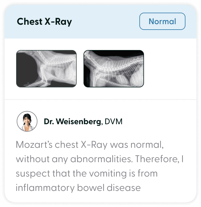
Quickly access records and view results in visual, swipe-able cards.
High Level App Overview


User Journey
Uncovering ways to make pet health easier by automating steps, reducing friction, and seamlessly connecting different sections of the app, informed by a user journey
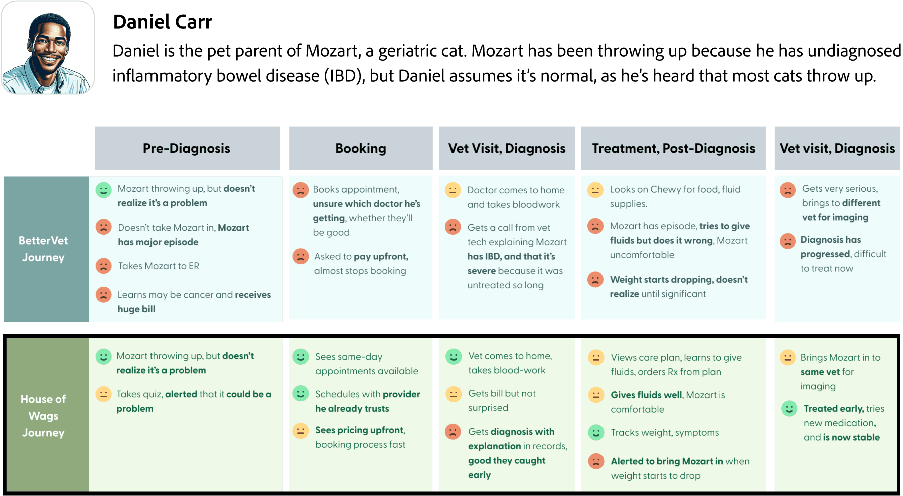
Daniel is the proud pet parent of Mozart, a geriatric cat. Mozart has been throwing up lately because he has undiagnosed inflammatory bowel disease (IBD), but Daniel assumes that it’s normal, as he’s heard that most cats throw up.
Daniel Carr

I created a journey for the leading home vet, BetterVet, and a journey for House of Wags that solves the key problems I identified.
Booking an appointment
Building trust through imagery and transparency
Happy animal and vet photos show that you are choosing an empathetic service. Unlike competitors, the app proactively provides important information with a pricing page showing the travel fee and the ability to view the vet you’re booking with and their bio.
Automating and simplifying booking to make it easier
Removed friction via auto-generated visit reasons, auto-selection for soonest available, and easy to scan content.
Caters to two customer types: first-timers deciding to purchase and returning customers, who want to book fast.

Final Designs

Health monitoring and prevention
Information at a glance with color-coded visuals
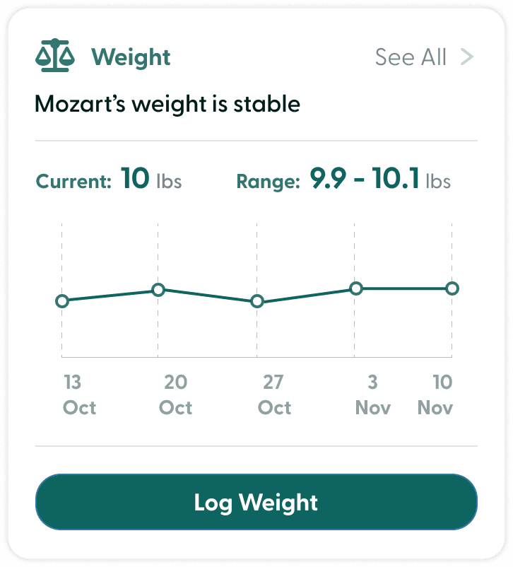
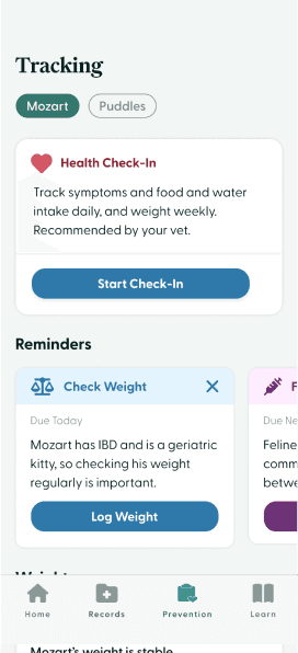
Weight and symptom tracking use data visuals and color to show results at a glance. Reminders are easy to identify but don’t take up much space to be unobtrusive. CTA’s within reminders make taking action easy.
Quick check-ins and automated alerts
Health check-ins take less than one minute and are easy to find at the top. If the check-in is abnormal, you are automatically alerted to schedule a vet visit.
Pets can’t talk. Catch your pet's illness early by tracking pet’s weight and symptoms and stay on top of preventive care with reminders.
Care plan
Balancing overview with ability to dive deep
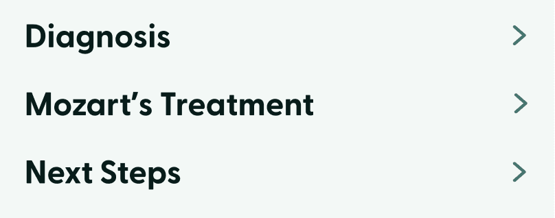
Digestible drop-downs for each section don’t overwhelm you with information and allow for progressive disclosure when details are needed. Treatment steps and next steps use digestible cards.
Seamless Integration with Health Content, Health Tracking
Important videos like “Learn More About Diagnosis” or “Administering Fluids” are included within each section. Plans feature custom, diagnosis-specific tracking notifications. Follow-up visits can be booked directly from the plan with the recommended date automatically selected.
After each appointment, you receive a care plan with the diagnosis, treatment, and next steps.






Improving visual representation of step-by-step processes for users
I made each step in the care plan less overwhelming by using dotted lines with circles to connect steps and in the booking process by using a progress bar that is filled almost to the next step.
Using photos for empathy and credibility
I used images of happy pets and smiling veterinarians throughout to emphasize empathy and build trust.
Improving speed with glanceability, providing details as needed
I focused on making components easy to digest, with more information available but de-emphasized or hidden until needed. This improved speed at completing tasks without compromising care quality.

Video visits
Video visit makes sharing screen easy
It’s easy to flip the camera to show your pet because the button is near your thumb. The experience overall is simple with minimal distractions.
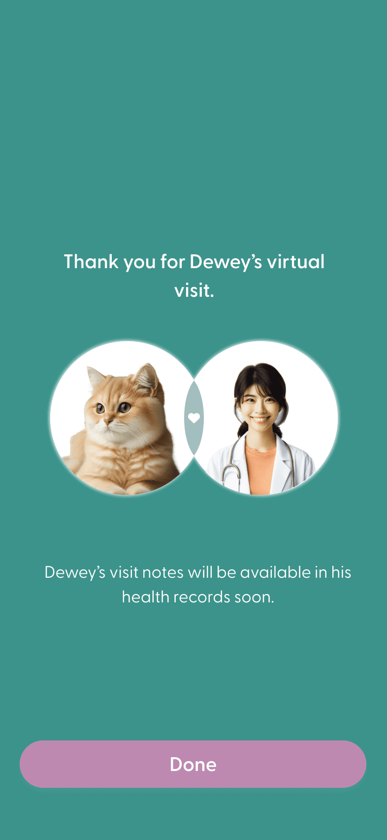
Building trust between pets, owner, and vet
On the waiting screen, the vet is shown along with her title to build trust.
Customers can be seen via video visit during off-hours to avoid an emergency room trip.
Fun and personalized programs
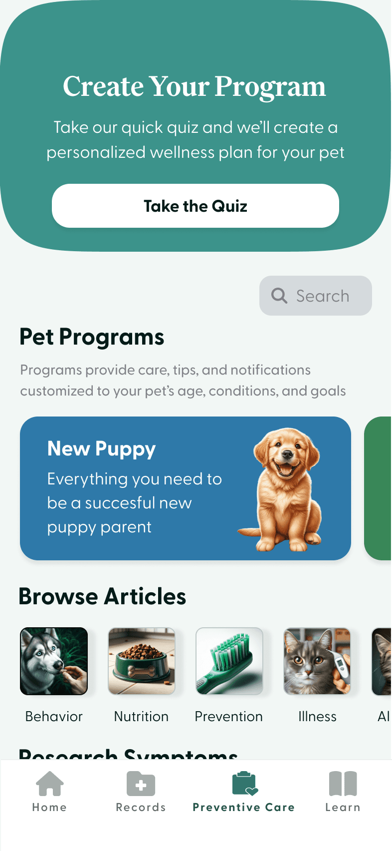
Personalized quiz creates more relevant program
Grouping content into programs for increased engagement
Unlike most veterinary apps that feature stand-alone articles, this app groups content into programs that progress step-by-step and feature gamification. Each program contains videos and articles specific to an age, condition, or goal.
For those who desire, a personalized quiz creates a program that uncovers health, behavior, and emotional goals that are unique to your pet.
You can create a personalized pet wellness program or choose from pre-made programs.

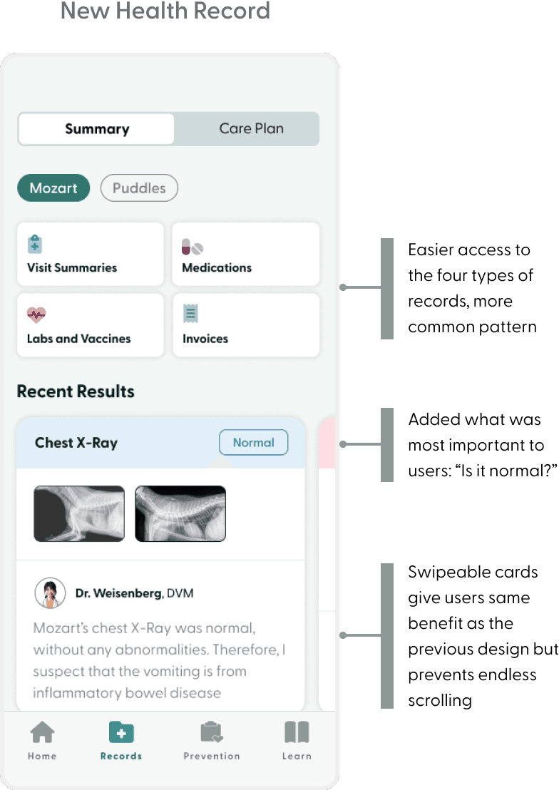
5/5 users successfully completed all tasks, but I made small changes to most pages before creating the mock-ups shown above. The health record had the biggest changes.
User Testing
Improving the health records page to enable quick record retrieval

Visual Design
“Greycliff” for sans serif
Aa Bb Cc Dd Ee Ff Gg Hh Ii Jj Kk
“Family” for serif
Aa Bb Cc Dd Ee Ff Gg Hh Ii Jj Kk
Primary
Secondary
Background
Neutrals
Header 1 - (Family 30)
Header 2 - (Greycliff 24)
Header 3 - (Greycliff 21)
Body - (Greycliff 17)
Description - (Greycliff 14.3)





Empathetic and trustworthy colors
Chose a cool green as the most used color, which is neutral enough to be credible but still feels fresh and empathetic. The purple, blue, and red are used to differentiate certain cards, actions, and buttons.
Friendly but sophisticated typography
The serif font “Family” feels warm and friendly but also sophisticated. “Greycliff” for the sans serif is readable and credible, but also has a touch of softness.
Color-coded card system
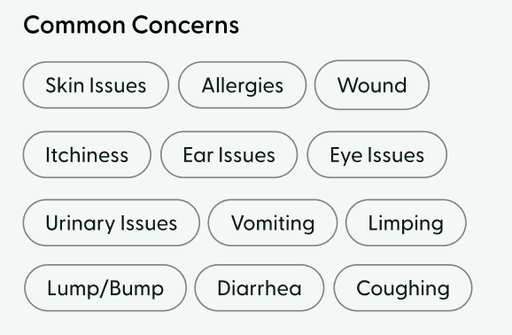
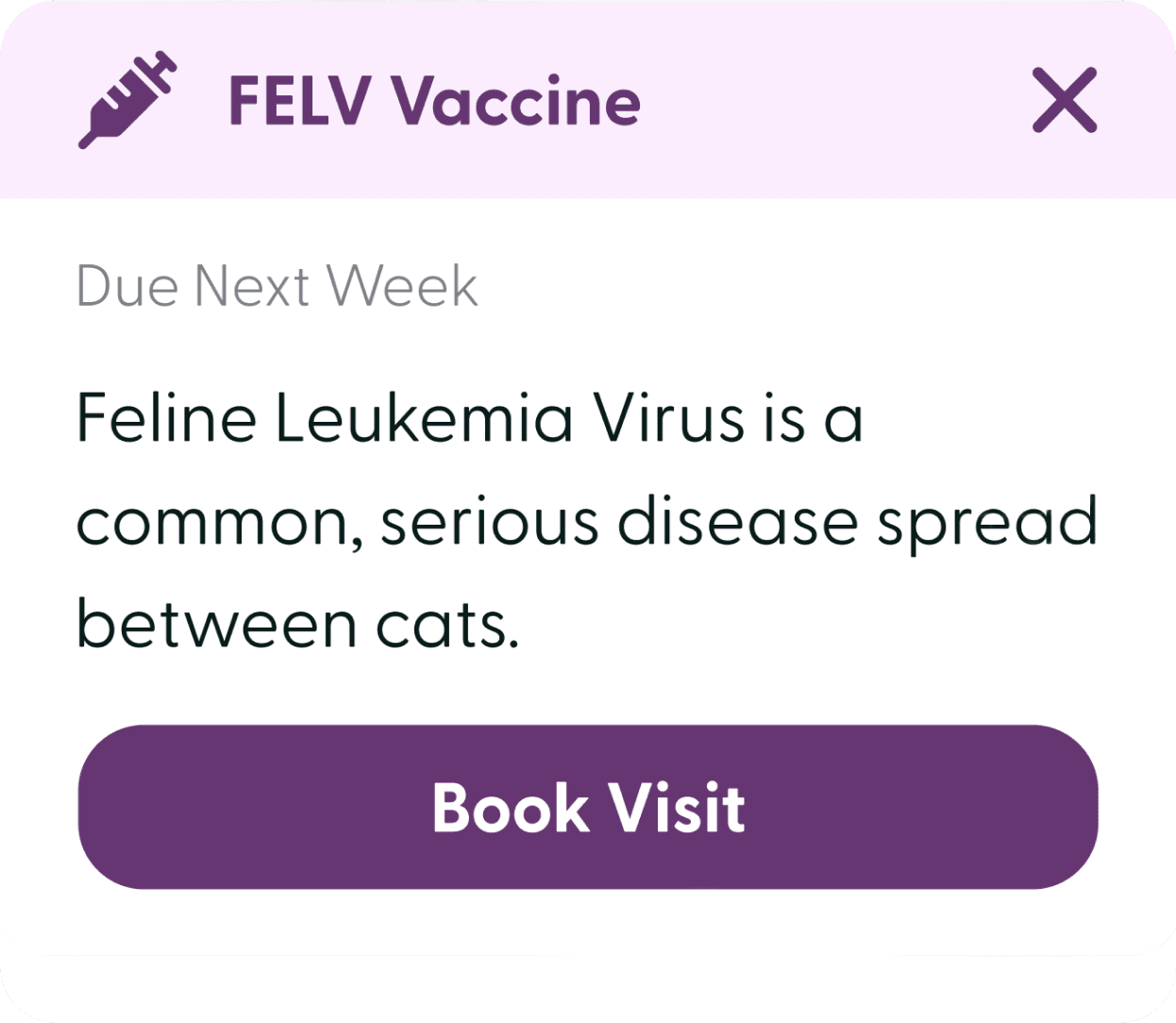
Color was used to differentiate cards and their data. For test results and symptom data, I used red to indicate abnormal and green and blue for normal. Reminder cards were color coded to make them easily identifiable (e.g. purple for vaccines).
Next Steps
If I had more time, I would conduct more user testing and build out the full flow for the app. I would also interview veterinarians to ensure their perspective is represented.
What I Learned
Don’t get too focused on competition. Look for ideas beyond direct competitors.
Push yourself to use all research from the start. You can always cut features.
I got so focused on home vet care that I initially didn’t incorporate research on challenges of sick pets. If I were doing this project over, I would incorporate this from the start.
When I started the project, I focused quite a bit on competitors. While this is important, I could have pushed myself sooner to look beyond veterinary companies to broader health tech trends.


House of Wags provides personalized, technology-powered veterinary care at home and in-person for owners that want to level up their pet care while also offering their pets a better experience. Owners can create a custom wellness plan with guided content and care, track their pet’s health in the app, access records and care plans, and book home, video, and in-person appointments.
As the only team member and product designer, I created the entire product from the ground up, leveraging both strategic and visual UX thinking.
Timeline
Oct 2023 - Dec 2023
Role
Product Designer
House of Wags

Observation
To the right are my pets, Dewey, Mozart, and Puddles. Observing them, I realized they all hate going to the vet, and taking care of them when sick is more challenging than it should be.


Generative Interview Insights
Going to the vet is anxiety-provoking for pets, and owners want services that would make it easier for them to take care of sick pets and keep pets healthy
All participants reported the status quo veterinary experience is anxiety-provoking for their pet, and they all desire home vet care to reduce pet anxiety.
4 didn’t know home care exists, and 2 don’t use it because they often can’t see the same vet each time, especially with some services required in-person
Interviewees want help taking care of sick pets and keeping their pets healthy, including tracking for new or worsening symptoms and preventive care, and digestible information on physical and emotional pet health
1
2
3
Home vets
In-person vets
3%
97%
Home veterinary care only offered by 3% of vets in CO
I interviewed six adults who have pets, from a variety of income ranges, with the following insights:
Customer Personas
Discovering three distinct personas based on what they value in a vet
Single Vet Preferencer
Values continuity of care
Values forward-thinking technology and additional services
How They Guided Design:
Added additional, forward-thinking services including telehealth, personalized wellness plans, visuals for digital tracking, and health record results cards.
Extra Features Enthusiast
Values seeing the vet they know and trust every time
How They Guided Design:
Users choose their vet, every time, and this benefit is emphasized in the booking flow. Also increased vet’s connection beyond in-person interactions with digital care plan.
Single Vet Preferencer
Values convenience and enjoyability
How They Guided Design:
Linked educational resources within care plan for convenience, provided images of happy animals to increase enjoyment in booking flow, and created fun, guided tracks.
Experience Emphasizer


Competitive Analysis: Features
Uncovering market gaps with a competitive analysis
97% of vets don’t offer mobile care. The other 3% don’t usually offer in-office care and offer fewer services, so owners must use two vets if they want mobile care.
Majority of vets only offer in-office care
Most vets don’t have a mobile app, accessible health records, or telehealth, features that are now standard in human health care.
Veterinary technology is stuck in the stone ages
The small percentage of companies that do offer an app all offer a similar, and limited, set of features, leaving room for more innovation.
For those that offer an app, features are limited


How Might We’s
“How might we help improve pet health by offering tech-enabled, comprehensive care that helps pet parents be more informed and engaged in keeping their pets healthy?”
How might we implement health tracking to catch problems with pets before they get serious?
How might we apply human patient education best practices for increased understanding and adherence?
How might we use a personalized quiz to make pet content more relevant and goal-oriented?
How might we use guided programs to make pet health content more digestible and rewarding?
User Journey
Uncovering ways to make pet health easier by automating steps, reducing friction, and seamlessly connecting different sections of the app, informed by a user journey.


Daniel is the pet parent of Mozart. Mozart has been throwing up because he has undiagnosed inflammatory bowel disease (IBD), but Daniel assumes it’s normal, as he’s heard most cats vomit.
Daniel Carr


I created a journey for leading home vet company, BetterVet, and a journey for House of Wags that solves the key problems I identified.
Single Vet Preferencer
Values continuity of care
House of Wags offers both in-person and in-home, mobile veterinary care. This allows customers to see the same vet every time, in the setting that makes sense for their pet. It also differentiates House of Wags from the majority of competitors.
Offering a broader set of veterinary services than existing options
Personalized, guided programs, weight and symptom tracking, and digital care plans enable better care. This combination of features is not offered by any competitor.
Digital features unique to the industry that enable better care
Most vets don’t have a mobile app, accessible health records, or telehealth. House of Wags brings veterinary care out of the stone ages by including these features.
Bringing human health technology standards to an outdated industry
Home
Choose a home, video, or in-person visit.
Booking Appointment
Fast, frictionless booking process that builds trust.
Preventive Care Tracking
Track weight and symptoms with daily check-in, visualize results, and get reminders for preventive care.
Digital Care Plan
Understand diagnosis, treatment, and next steps.
Personalized, Guided Program
Create your own or choose a pre-made program with guided videos, tips, and reminders.
Video Visit
Quickly access records and view results in visual, swipe-able cards.
Records
Conduct a remote visit straight from the app.
High Level App Overview


Booking an appointment
Building trust through imagery and transparency
Happy animal and vet photos show that you're choosing an empathetic service. Unlike competitors, the app proactively provides important information with a pricing page showing travel fee and the ability to view the vet you’re booking with and their bio.
Automating and simplifying booking to make it easier
Removed friction via auto-generated visit reasons, auto-selection for soonest available, and easy to scan content.
Caters to two customer types: first-timers deciding to purchase and returning customers, who want to book fast.


Final Designs


Health monitoring and prevention
Information at a glance with color-coded visuals
Weight and symptom tracking use data visuals and color to show results at a glance. Reminders are easy to identify but don’t take up much space to be unobtrusive. CTA’s within reminders make taking action easy.
Quick check-ins and automated alerts
Health check-ins take less than one minute and are easy to find at the top. If the check-in is abnormal, you are automatically alerted to schedule a vet visit.
Pets can’t talk. Catch your pet's illness early by tracking pet’s weight and symptoms and stay on top of preventive care with reminders.
Care plan
Balancing overview with ability to dive deep
Digestible drop-downs for each section don’t overwhelm you with information and allow for progressive disclosure when details are needed. Treatment steps and next steps use digestible cards.
Seamless Integration with Health Content, Health Tracking
Important videos like “Learn More About Diagnosis” or “Administering Fluids” are included within each section. Plans feature custom, diagnosis-specific tracking notifications. Follow-up visits can be booked directly from the plan with the recommended date automatically selected.
After each appointment, you receive a care plan with the diagnosis, treatment, and next steps.


Improving visual representation of step-by-step processes for users
I made each step in the care plan less overwhelming by using dotted lines with circles to connect steps and in the booking process by using a progress bar that is filled almost to the next step.
Using photos for empathy and credibility
I used images of happy pets and smiling veterinarians throughout to emphasize empathy and build trust.
Improving speed with glanceability, providing details as needed
I focused on making components easy to digest, with more information available but de-emphasized or hidden until needed. This improved speed at completing tasks without compromising care quality.


Video visits
Video visit makes sharing screen easy
It’s easy to flip the camera to show your pet because the button is near your thumb. The experience overall is simple with minimal distractions.
Building trust between pets, owner, and vet
On the waiting screen, the vet is shown along with her title to build trust.
Customers can be seen via video visit during off-hours to avoid an emergency room trip.
Fun and personalized programs
Personalized quiz creates more relevant program
Grouping content into programs for increased engagement
Unlike most veterinary apps that feature stand-alone articles, this app groups content into programs that progress step-by-step and feature gamification. Each program contains videos and articles specific to an age, condition, or goal.
For those who desire, a personalized quiz creates a program that uncovers health, behavior, and emotional goals that are unique to your pet.
You can create a personalized pet wellness program or choose from pre-made programs.


5/5 users successfully completed all tasks, but I made small changes to most pages before creating the mock-ups shown above. The health record had the biggest changes.
User Testing
Improving the health records page to enable quick record retrieval


“Family” for serif
Aa Bb Cc Dd Ee Ff Gg Hh Ii Jj Kk
“Greycliff” for sans serif
Aa Bb Cc Dd Ee Ff Gg Hh Ii Jj Kk
Visual Design
Primary
Secondary
Background
Neutrals
Header 1 - (Family 30)
Header 2 - (Greycliff 24)
Header 3 - (Greycliff 21)
Body - (Greycliff 17)
Description - (Greycliff 14.3)


Empathetic and trustworthy colors
Chose a cool green as the most used color, which is neutral enough to be credible but still feels fresh and empathetic. The purple, blue, and red are used to differentiate certain cards, actions, and buttons.
Friendly but sophisticated typography
The serif font “Family” feels warm and friendly but also sophisticated. “Greycliff” for the sans serif is readable and credible, but also has a touch of softness.
Color-coded card system
Color was used to differentiate cards and their data. For test results and symptom data, I used red to indicate abnormal and green and blue for normal. Reminder cards were color coded to make them easily identifiable (e.g. purple for vaccines).


Next Steps
If I had more time, I would conduct more user testing and build out the full flow for the app. I would also interview veterinarians to ensure their perspective is represented.
What I Learned
Don’t get too focused on competition. Look for ideas beyond direct competitors.
Push yourself to use all research from the start. You can always cut features.
I got so focused on home vet care that I initially didn’t incorporate research on challenges of sick pets. If I were doing this project over, I would incorporate this from the start.
When I started the project, I focused quite a bit on competitors. While this is important, I could have pushed myself sooner to look beyond veterinary companies to broader health tech trends.




How Might We’s
“How might we improve pet health by offering tech-enabled, comprehensive care that helps pet parents be more informed and engaged in keeping their pets healthy?”
How might we implement health tracking to catch problems with pets before they get serious?
How might we apply human patient education best practices for increased understanding and adherence?
How might we use guided programs to make pet health content more digestible and rewarding?
How might we use a personalized quiz to make pet content more relevant and goal-oriented?
Customer Personsas
Discovering three distinct personas based on what they value in a vet

Extra Features Enthusiast
Values forward-thinking technology and additional services
How They Guided Design:
Added additional, forward-thinking services including telehealth, personalized wellness plans, visuals for digital tracking, and health record results cards.

Single Vet Preferencer
Values seeing the vet they know and trust every time
How They Guided Design:
Users choose their vet, every time, and this benefit is emphasized in the booking flow. Also increased vet’s connection beyond in-person interactions with digital care plan.

Experience Emphasizer
Values convenience and enjoyability
How They Guided Design:
Linked educational resources within care plan for convenience, provided images of happy animals to increase enjoyment in booking flow, and created fun, guided tracks.
Generative Interview Insights
Going to the vet is anxiety-provoking for pets, and owners want services that would make it easier for them to take care of sick pets and keep pets healthy
I interviewed six adults who have pets, from a variety of income ranges, with the following insights:
1 . All participants reported the status quo veterinary experience is anxiety-provoking for their pet, and they all desire home vet care to reduce pet anxiety.
2 . 4 didn’t know home care exists, and 2 don’t use because they often can’t see the same vet each time, especially with some services required in person.
3 . Interviewees want help taking care of sick pets and keeping their pets healthy, including tracking for new or worsening symptoms and preventive care, and digestible information on physical and emotional pet health.
Home veterinary care only offered by 3% of vets in CO
Observation
Below are my pets, Dewey, Mozart, and Puddles. Observing them, I realized they all hate going to the vet, and taking care of them when sick is more challenging than it should be

Competitive Analysis: Features
Uncovering market gaps with a competitive analysis
Veterinary technology is stuck in the stone ages
Most vets don’t have a mobile app, accessible health records, or telehealth, features that are now standard in human health care.
Majority of vets only offer in-office care
97% of vets don’t offer mobile care. The other 3% don’t usually offer in-office care and offer fewer services, so owners must use two vets if they want mobile care.
For those that offer an app, features are limited

The small percentage of companies that do offer an app all offer a similar, and limited, set of features, leaving room for more innovation.


House of Wags
House of Wags provides personalized, technology-powered veterinary care at home and in-person for owners that want to level up their pet care while also offering their pets a better experience. Owners can create a custom wellness plan with guided content and care, track their pet’s health in the app, access records and care plans, and book home, video, and in-person appointments.
As the only team member and product designer, I created the entire product from the ground up, leveraging both strategic and visual UX thinking.
Role
Product Designer
Timeline
Oct 2023 - Dec 2023
User Journey
Uncovering ways to make pet health easier by automating steps, reducing friction, and seamlessly connecting different sections of the app, informed by a user journey.
I created a journey for the leading home veterinary company, BetterVet, and a journey for House of Wags that solves the key problems I identified.

High Level App Overview





Offering a broader set of veterinary services than existing options
House of Wags offers both in-person and in-home, mobile veterinary care. This allows customers to see the same vet every time, in the setting that makes sense for their pet. It also differentiates House of Wags from the majority of competitors.


Digital features unique to the industry that enable better care
Personalized, guided programs, weight and symptom tracking, and digital care plans enable better care. This combination of features is not offered by any competitor.
Bringing human health standards to an outdated industry
Most vets don't have a mobile app, accessible health records, or telehealth. House of Wags brings veterinary care out of the stone ages by including these features.
Final Designs
Booking an appointment
Caters to two customer types: first-timers deciding to purchase and returning customers, who want to book fast.
Automating and simplifying booking to make it easier
Removed friction via auto-generated visit reasons, auto-selection for soonest available, and easy to scan content.
Building trust through imagery and transparency
Happy animal and vet photos show that you're choosing an empathetic service. Unlike competitors, the app proactively provides important information with a pricing page showing travel fee and the ability to view the vet you’re booking with and their bio.


Care plan
After each appointment, you receive a care plan with the diagnosis, treatment, and next steps.
Balancing overview with ability to dive deep
Digestible drop-downs for each section don't overwhelm you with information and allow for progressive disclosure for when details are needed. Treatment steps and next steps use digestible cards.
Seamless Integration with Health Content, Health Tracking
Important videos like "Learn More About Diagnosis" or "Administering Fluids" are included within each section. Plans feature custom, diagnosis-specific tracking notifications. Follow-up visits can be booked directly from the plan with the recommended date automatically selected.

Using photos for empathy and credibility
I used images of happy pets and smiling veterinarians throughout to emphasize empathy and build trust.


Improving speed with glanceability, providing details as needed
I focused on making components easy to digest, with more information available but de-emphasized or hidden until needed. This improved speed at completing tasks without compromising care quality.


Improving visual representation of step-by-step processes for users
I made each step in the care plan less overwhelming by using dotted lines with circles to connect steps and in the booking process by using a progress bar that is filled almost to the next step.


Health monitoring and prevention
Pets can't talk. You can catch your pet's illness early by tracking pet's weight and symptoms and stay on top of preventive care with reminders.
Quick check-ins and automated alerts
Health check-ins take less than one minute and are easy to find at the top. If the check-in is abnormal, you are automatically alerted to schedule a vet visit.
Information at a glance with color-coded visuals
Weight and symptom tracking use data visuals and color to show results at a glance. Reminders are easy to identify but don't take up much space to be unobtrusive. CTA's within reminders make taking action easy.
Video visits
Customers can be seen via video visit during off-hours to avoid an emergency room trip.
Building trust between pets, owner, and vet
On the waiting screen, the vet is shown along with her title to build trust.
Video visit makes sharing screen easy
It’s easy to flip the camera to show your pet because the button is near your thumb. The experience overall is simple with minimal distractions.
Fun and personalized programs
You can create a personalized pet wellness program or choose from pre-made programs.
Grouping content into programs for increased engagement
Unlike most veterinary apps that feature stand-alone articles, this app groups content into programs that progress step-by-step and feature gamification. Each program contains videos and articles specific to an age, condition, or goal.
Personalized quiz creates more relevant program
For those who desire, a personalized quiz creates a program that uncovers health, behavior, and emotional goals that are unique to your pet.


User Testing
Improving the health records page to enable quick record retrieval
5/5 users successfully completed all tasks, but I made small changes to most pages before creating the mock-ups shown above. The health record had the biggest changes.

Visual Design
Empathetic and trustworthy colors
Chose a cool green as the most used color, which is neutral enough to be credible but still feels fresh and empathetic. The purple, blue, and red are used to differentiate certain cards, actions, and buttons.


Friendly but sophisticated typography
The serif font “Family” feels warm and friendly but also sophisticated. “Greycliff” for the sans serif is readable and credible, but also has a touch of softness.


Card system
Color was used to differentiate cards and their data. For test results and symptom data, I used red to indicate abnormal and green and blue for normal. Reminder cards were color coded to make them easily identifiable (e.g. purple for vaccines).


Next Steps
If I had more time, I would conduct more user testing and build out the full flow for the app. I would also interview veterinarians to ensure their perspective is represented
What I Learned
Don’t get too focused on competition. Look for ideas beyond direct competitors
When I started the project, I focused quite a bit on competitors. While this is important, I could have pushed myself sooner to look beyond veterinary companies to broader health tech trends.
Push yourself to use all research from the start. You can always cut features
I got so focused on home vet care that I initially didn’t incorporate research on challenges of sick pets. If I were doing this project over, I would incorporate this from the start.
